SPONSORED CONTENT
Dalton Maag is a typeface design studio based in London. The studio works with designers and branding specialists worldwide to help clients find their best typographic expression — from logotype refinement, font licensing and font modification, to the creation of custom font suites. Working with clients of all sizes and across all sectors, Dalton Maag’s team spans twenty nationalities and speaks twelve languages, bringing design expertise to every project. Some of the most recognisable work was made for Airbnb, BBC, Amazon, and Rio 2016. On Dalton Maag’s website you can find plenty of case studies for inspiration and explore typefaces from their font library.
Bianca Berning, Creative Director at Dalton Maag, works at the intersection of typography, type design, and technology. She is the author of this article.
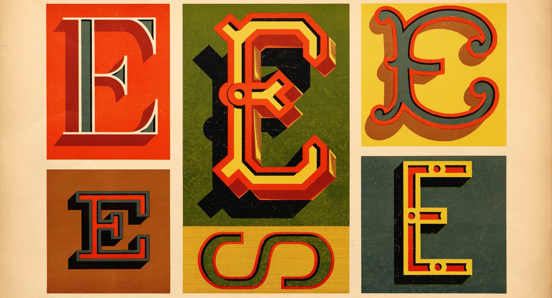
Cover image by Paul Fleury, from Letterform Archive.
We all use Color Fonts in our daily lives but most of us probably don’t even realise it.
It all started with emoji
From the mid-2000s emoji were becoming increasingly popular outside of Japan. In 2007, they were added to the Unicode Standard; the information technology standard concerned with the consistent encoding of characters to enable people to use keyboards to type their texts in nearly every language. Adding emoji to the Unicode standard meant that, like any other character, an emoji would show up consistently across platforms and devices. If you sent a sailboat emoji ⛵️ (Unicode U+26F5) from your Android phone to your friend’s iPad, although the design of the emoji might be slightly different, thanks to Unicode it would still show as a sailboat. You might wonder why someone designing letterforms for a living would be intrigued by the rise of emoji? Because the same technology used to provide colourful emoji fonts actually opens up the world of flamboyant Display typography for use on the web.
As a typeface designer, my professional world mostly consists of black and white spaces, of shapes and counter shapes and their relationship between each other. My job has always been to provide designers with a set of glyphs, which in turn they would bring to life on screen and paper. So, when I first heard of Color Fonts, almost a decade ago, I was immediately thrown out of my comfort zone. The idea of not only designing the typeface itself but also determining properties such as colours, layers, gradients, transparency, patterns, and even bitmaps seemed ludicrous. I felt there was a risk that if we shifted the responsibility for colours and effects away from graphic designers and over to typeface designers, it would reduce creative flexibility. That was until I understood just how difficult it is to apply anything that goes beyond a simple ‘fill’ to a typical font on the web.
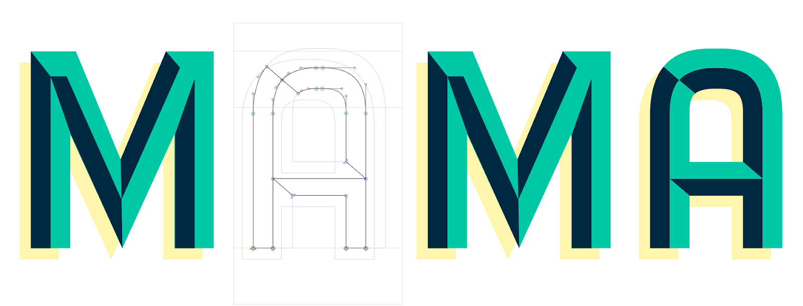
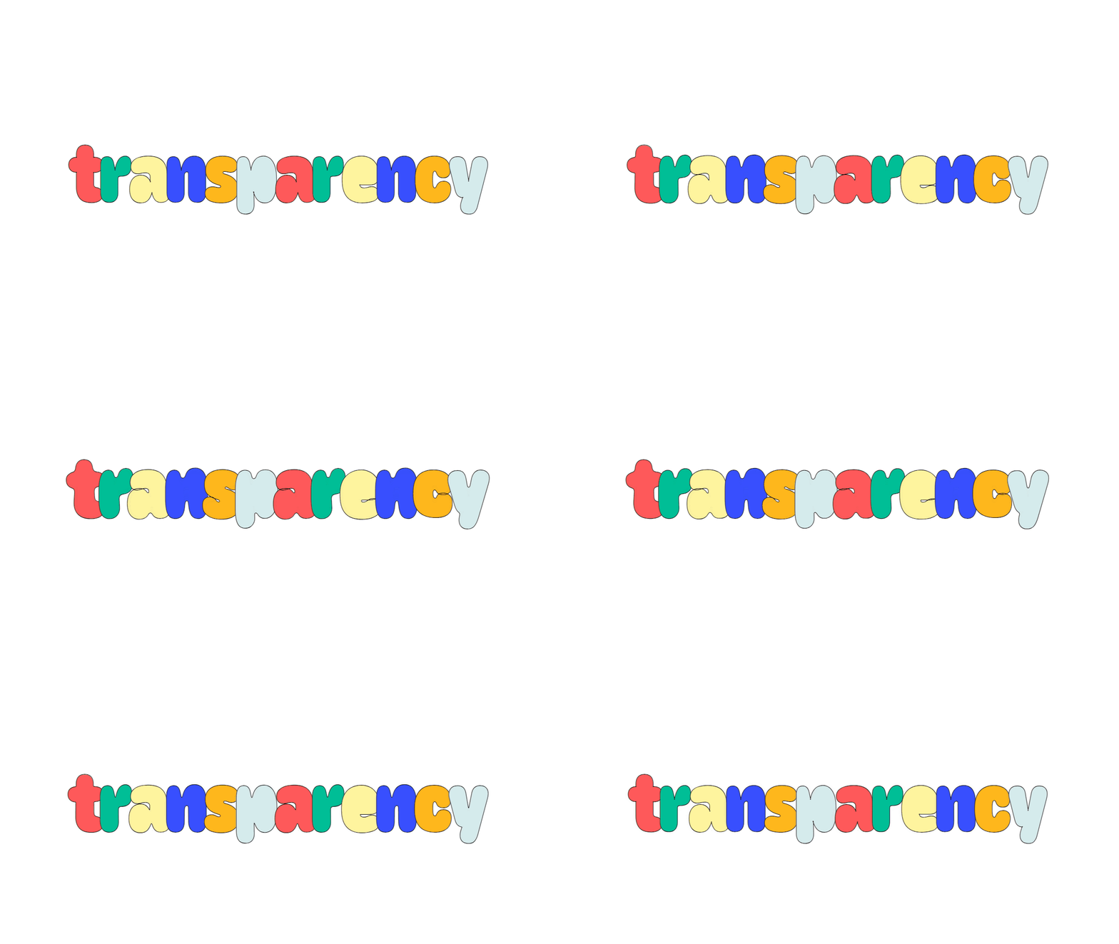
Color Fonts are designed to solve this exact problem — they make it easier to apply effects and filters to letters without awkward workarounds (for example images containing text instead of genuine text to make a website visually appealing).

The first Color Fonts solutions
My interest was piqued and I wanted to explore how I could start to incorporate Color Fonts into my work as a type designer. At this time, tech titans Adobe, Apple, Google, and Microsoft, had individually begun to explore the possibilities of Color Fonts on the back of the increasing popularity of emoji and their adoption into the Unicode Standard.
The proposals that emerged were:
- Adobe teamed up with Mozilla to explore the potential of including scalable vector graphics (SVG) in OpenTypefonts. OpenType is a common font format.
- Apple’s proprietary sbix table and Google’s proposed CBDT/CBLC tables suggested to use a standard graphics format (such as PNG, JPEG, TIFF) which has obvious limitations in that the content can distort and pixelate when resized.
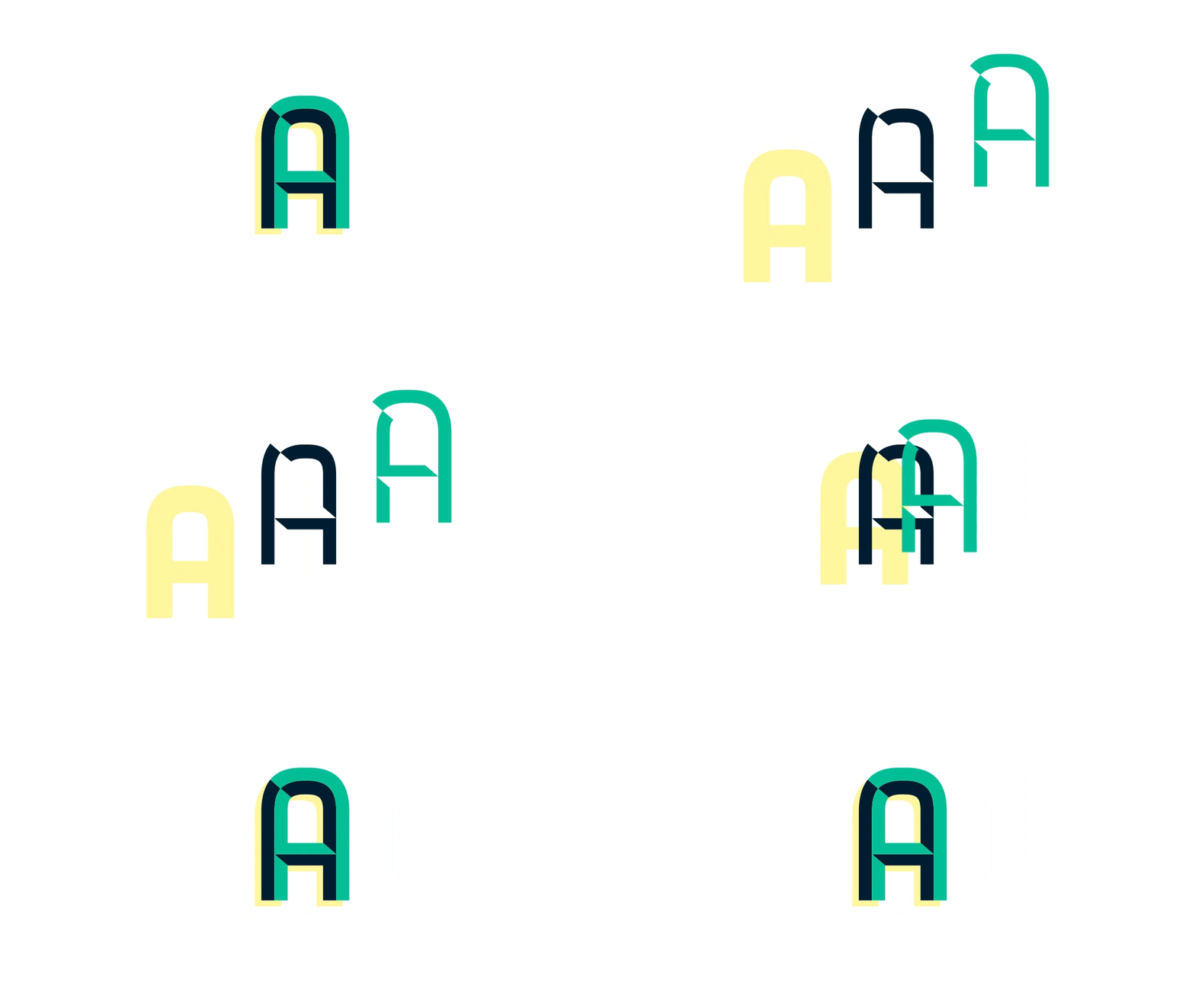
- And Microsoft proposed for each base glyph to be associated by the COLR table to a list of glyphs, each corresponding to layers that can be combined. The COLR table works together with another table (CPAL) which holds the color palettes used by the color layers.

In March 2015 Adobe’s, Google’s, and Microsoft’s proposals were added to the OpenType specification, which defines how most modern fonts are built. But what happens when four very large companies individually work on four very different approaches to solving the same problem? You end up with no single solution that is sufficiently supported by all browsers. And if a browser doesn’t happen to support the approach you implemented in your font, it would render the letters in your Color Font in either black and white, or not render them at all.
For font makers interested in adding Color Fonts (other than emoji) to their repertoire this was discouraging. In order to render the font as intended on a majority of browsers, you’d have to add multiple ways of describing your colour properties in your font file. The process adds to the size of the font file, and even with all that excess data, it was not guaranteed to actually work.
Even though the Color Font technology has been used successfully to render emoji for the past decade, it was largely dismissed for typography on the web because browser support was patchy, the increase in file size is a no-go for anyone concerned about web performance, and expressive typefaces will likely only be used sparingly anyway.
Fast forward to 2021 and there seems to be some movement in the largely achromatic world of fonts. About 5 years ago Adobe, Apple, Google, Microsoft, and a couple of independent typeface design studios collaborated on the addition of Font Variations (better known as variable fonts) to the OpenType specification. Around that time it seemed as if Adobe’s proposal was going to be adopted as the industry standard going forward but Chrome, as the most popular browser, never supported that table. Instead another contender, Microsoft’s COLR table, has enjoyed widespread popularity.
So much so that the team at Google recently developed a concept for a new format that builds onto Microsoft’s COLR table in another push to improve emoji rendering quality while decreasing the size of the font file.
The proposal suggests providing several graphics capabilities, such as support for gradients, transforms, composition and blending modes, in addition to the capabilities provided in the original COLRv0 table, such as shapes, solid colour fills and layering. In essence, COLRv1 will have a similar level of expressiveness as SVGs but it will weigh only a fraction of a font containing actual SVGs.


What does the future hold?
Given the difficult past of Color Fonts it would be premature to assume that this new proposal will be the game changer we’ve all been waiting for, but I’ll keep an eye on this technology, especially since COLR has already been well supported by most major browsers. It may not be a giant leap for them to upgrade to COLRv1.
Personally, I would love it if we could unlock another level of expression for web typography. If Color Font technology was more widely adopted, I’d also expect the number of images containing text to decrease dramatically — this would be an important step forward for accessibility on the web as assistive technologies, such as screen readers, cannot read text which is contained inside images.
In my ideal world we wouldn’t have to choose between expressive, colourful typography and efficient web loading. Color fonts would be straightforward to design, easy to use, and the files wouldn’t be heavier than monochromatic font files ? ? ?


