

There are a multitude of considerations when creating color palettes for design interfaces. Accessibility, perception, usability, and brand imagery are just a few of the most crucial. It is hardly surprising then, that designers opt for pre-built palettes that handle these difficult reflections for them. But as ‘one size fits all’ does not fit all, nor do pre-curated color schemes. On the other hand, customizing color palettes to fit each project creates a superior finished product and gives you the ability to include a wider audience.
In her talk, Laura Kalbag relays the significance of customizing your color palette for each design project and how to optimize it for the digital space.
Laura is co-owner of the nonprofit two-person and one-husky organization, Small Technology Foundation. She is a designer who advocates for social justice in this digital age and is a self-proclaimed color nerd. She authored ‘Accessibility for Everyone’ and is an avid conference speaker -to spread awareness and her wisdom.

Established developer frameworks are useful for optimizing your color palette for digital interfaces. They are, however, not the most ingenious way of creating enticing user interfaces or experiences. And by constructing your color palette -you can ensure that you design for accessibility.
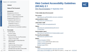
Color hues and saturations are not the only points to consider when designing for accessibility, but their alternatives are also vital, to ensure that all are included in the UX. Meaning that people who are for instance color-blind, have limited or impaired vision, or are blind have a good user experience along with users without these limitations. Luckily there are guidelines to aid us with all these considerations in the creative development process: the Web Content Accessibility Guidelines (WCAG).
As a side note, these are also the standards used in lawsuits against inaccessible design. So they’re useful principles to keep in mind!
A quick review of the important points of WCAG:
Principle 1: Perceivable: Making sure that all users can perceive content correctly
1.1 Text alternatives are equivalent to non-text content, and they serve to ensure minimum misunderstanding of information.
For instance, if you have a user who wants to buy a long navy coat, write a text that describes the coat and color. Writing navy instead of just showing a colored swatch square, which can be perceived as another color, is more accessible -and a lack of information might lose potential users to a more inclusive website that offers a text alternative.

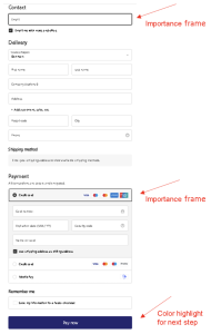
1.4 Distinguishable: using color as a visual means of conveying information. For instance, when a square is highlighted to show where to fill out information or to move forward to the next step, making it clear for every possible user. Highlight, blink, strobe, embolden, animate: the universe of creativity is endless. Think inclusive when constructing interfaces, and remember: designers historically thrive under restraints.
1.4.3 Minimum contrast is the visual presentation of text and images of text that has at least a 4.5:1 ratio of contrast.
1.4.6 Enhanced contrast is a 7:1 ratio from the foreground to the background of a visual digital display, which is particularly beneficial for users with visual impairment and is implemented through a highly contrasting color palette.
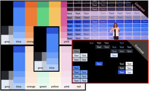
1.4.11 Non-text contrast should have at least a 3:1 ratio against adjacent colors. User interface components need to have contrasts, which means that visual digital information is required to identify user interface components and states. For example, a button needs to look like a button, and it has to be distinguishable from the background.
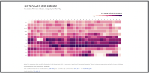
Graphical objects need contrast. For example, the graph depicted below is hard to read and evaluate due to the low contrast between the different squares, making it hard to distinguish the data accurately -making it imprecise.
Applicable contrast ratio tools
Now that we know the most important principles of contrast in regards to designing accessible interfaces. A few helpful tools for the creative process easier are compiled below and are of course recommended by Laura.
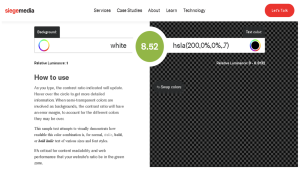
1. Contrast-ratio tool by SiegeMedia is a great tool if you work with transparency, as it has an opacity function.
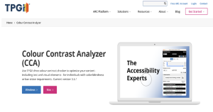
2. Color contrast analyzer (CCA) by TPGI is a tool that you can install to help you evaluate the foreground and background colors. It has adjustable sliders -so you can optimize your shades for contrast.
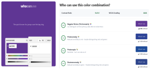
3. WhoCanUse tells you the usability of your content, who can use it, and who cannot.
Accessibility -the restraints that Designers thrive under
Accessible design does limit your creative color choices and palette, but it is important for the usability and practical application of your design.
For instance, percentages of color opacities do not work as well on interfaces as they do on print. Using less ink to get a lighter shade of the same color is highly relevant in print designs. However, it does not translate well onto the digital screen, as the white light saturates and changes the perception of color.
It is therefore completely acceptable not to use the same color palette for print as for digital interfaces for the same company. But have an interpretation that shares a cohesiveness.
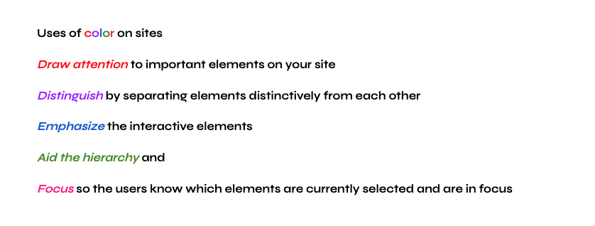
Color helps catch the users’ attention. You need to consider color to distinguish yourself, and what type of company you want to be perceived as -that is the overall point of using color in a brand.
Docusaurus has a useful color generator that you can use to play with your palette and quickly optimize your web designs. And tells you the digital accessibility of your color choices.

How to improve the accessibility of our sites
Start by looking at the brand colors. Pick a usable color for text that can be seen, this is where contrast shows its worth. And by choosing your colors by pairs, not just for the site’s text and accompanying background, but also for any background and its foreground on the site you make the process easier, as selecting colors by pairs will help to optimize the contrast and increase the accessibility and usability of the site.
Color convention also needs to be contemplated. For example, colored text usually means that it is interactive, like a link. While white or light text on a colored background is predominantly perceived as a button.
The site’s ‘dark mode’ also needs to be considered, as it requires just as much attention as its ‘light mode’. Inverting ‘light mode’ for your ‘dark mode’ is a default setting at best and not an accessible one of the kind. These different modes should be seen more from an inclusive standpoint than from an aesthetic one, though they can be both.
Good communication and documentation when working with others in the creative process is solid advice, to have all elements understood. Plus simplifying your vernacular, and limiting your design jargon is recommended, to make sure lines don’t get crossed or lost in translation. This saves time and frustration for all involved parties.
Usually when we design for digital display screens RGB (red, green, and blue) is the go-to color system. RGB can be combined in different proportions to obtain any color on the visible spectrum. However, a new color system has been devised, the LCH (Light, Chroma, and hue) color system to help make digital spaces more accessible and accurate.
Why Use LCH (Light, Chroma, and Hue)
LCH is a color system that is designed to represent colors in a way that is similar to how the human eye perceives color. In contrast, to the traditional RGB color system, which is primarily based on how displays emit light rather than how users perceive color. LCH provides a perceptual uniformity of quality, making digital designs more accessible.
LCH Break Down
Light (L): Represents the perceived brightness of color, ranging from black at 0 and white at 100. LCH’s lightness component is designed to be more perceptually uniform. This means that a change of the same numerical amount in lightness will result in a similar perceptual change in brightness across different colors.
Chroma (C): represents the intensity or vividness of the color. Higher chroma values indicate more intense colors, while lower values indicate more muted or desaturated colors.
Hue (H): This component denotes the perceived color itself, ranging from 0 to 360 degrees around the color wheel. Hue represents the dominant wavelength of light that gives the color its distinctive appearance. Hue is based on perceptual similarities between colors, making it more intuitive and consistent with human color perception.
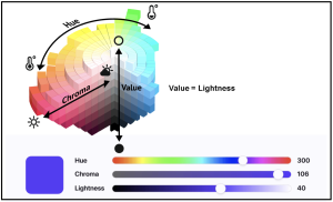
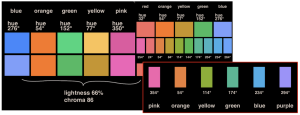
By using LCH (Lightness, chroma -saturation, and hue) when determining your color palette; you can set the lightness and chroma of all the hues to the same percentage setting. Selecting hues by similar intervals of degrees makes it possible to achieve a broader spectrum, making it easy for your digital color choices to vary while still being harmonious to the user’s eye. Generating the possibility of uniformity and vibrancy in the color palette of your digital space.
Color is a powerful tool, it creates atmosphere and helps good design go beyond the defaults. We hope you have felt inspired and not deterred by the guidelines, which are there to guide us to great creations and inclusive UX.
“Remember, design matters -but accessibility matters above all else.”
-Laura Kalbag
Watch the talk Laura gave at Design Matters 22 here.


