
This year Design Matters decided to stir things up in a slightly different direction. The overall theme we wanted to encapsulate in 2022 is sustainability and planet-centric design. Due to the vast concern we all feel regarding the Earth’s climate crisis, we shifted our attention to the UN sustainable development goals. Which allowed us to focus on developing more environmentally friendly solutions through design. Our 2021 design, with its organic shapes and animated bubbles and lines, was already hinting at the new course Design Matters will take this year.
What is your design process like?
It’s definitely messy, chaotic, but at the same time extremely fulfilling. At first, it’s all about excitement which quickly turns into panic once I realize what the process entails. I always start off by doing desk research. I don’t allow myself to make any fixed decisions before exploring what is already out there. I search for information regarding different visual styles and directions, and I gather all of my inspiration into mood boards. Afterwards, the real fun begins – the endless loop of various combinations and failed drafts accompanied by feedback and comments from my colleagues. When I am finally on the right track, it is just about editing and adjusting until I define the final design guide.
Where does your interest in digital design come from?
I guess being keen on digital design is kind of the trait of my generation. Technology practically runs in our veins, and we are being exposed to digital content from an early age. I think I always enjoyed visually-striking websites and mind-blowing animations, but the real attraction for this field sparked when I started my Multimedia Design studies. It was then that I realized that it is about much more than just “pretty” fonts or “nice” colors.
When creating the new visual identity for Design Matters 2022, what were some of the inspirations behind your vision?
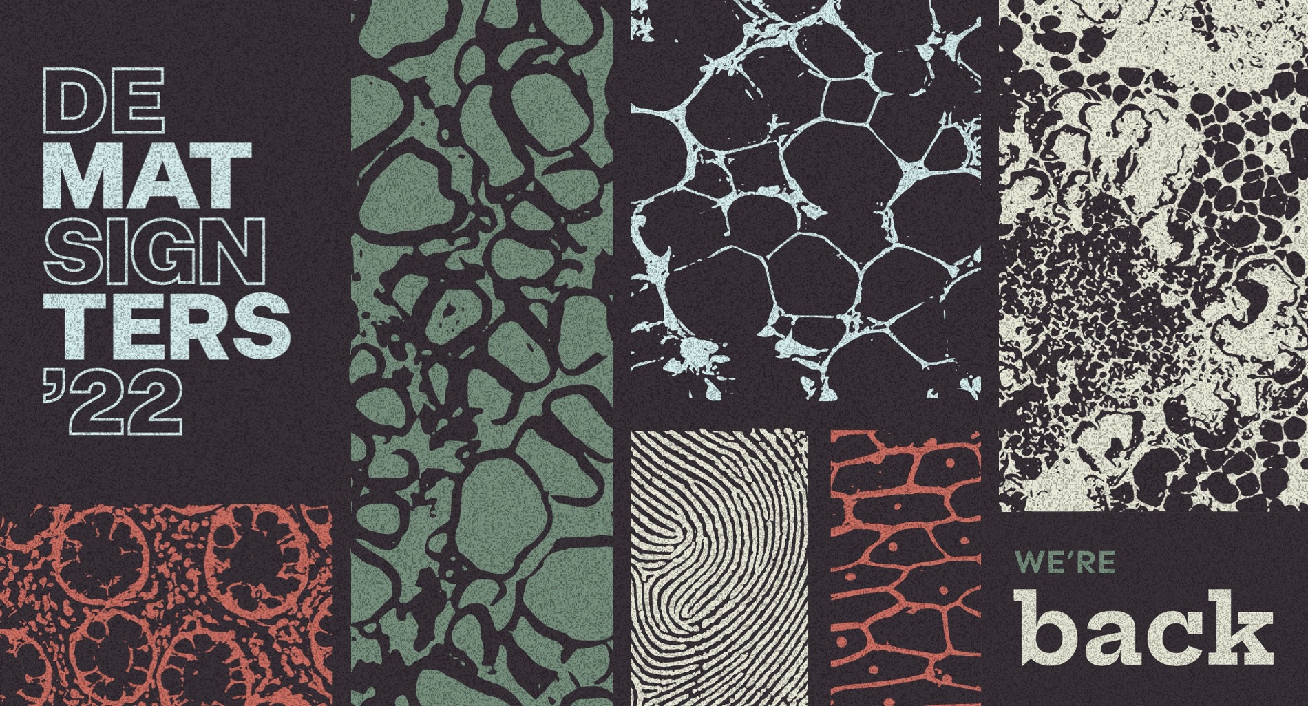
Dark background. Because why not?
The “dark background” idea came pretty spontaneously. After taking a closer look at what we did in the past, the realization washed over us like a tidal wave. In the past we have worked with a lot of vibrant, gradient and complementary colors, but we never truly focused on working with darker shades and hues.
Dark backgrounds could be tricky to work with and to incorporate into a user-friendly web solution, but then again, we are notorious risk-takers who do not flinch in front of a challenge. As digital designers who spend numerous hours gaping at the screen, we seek redemption in the dark interfaces, which provide relief to our weary eyes.
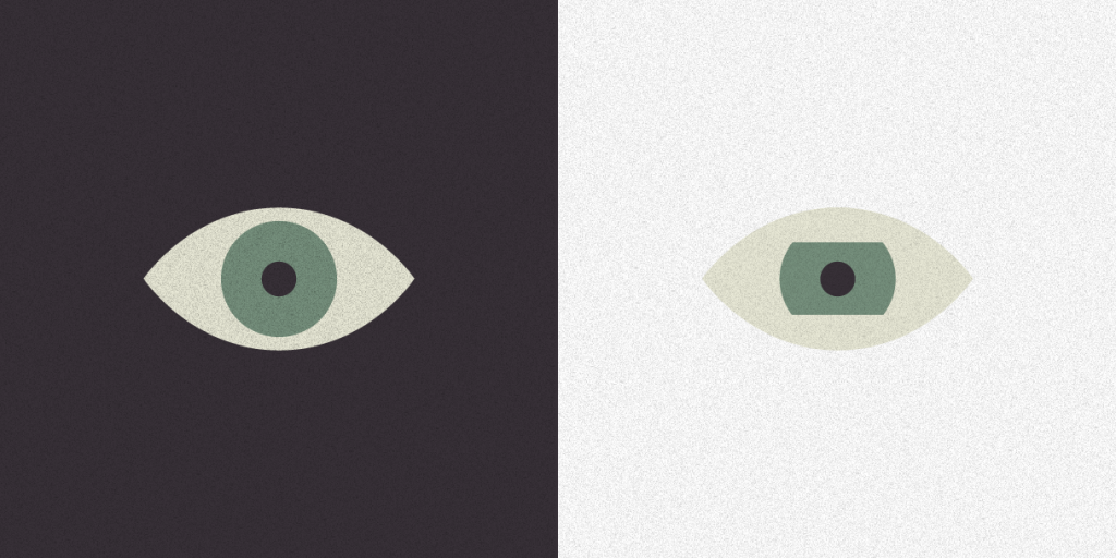
Besides reducing eye strain, black or dark backgrounds help to highlight design and visual content. They also work as generators of stronger emotions and add that pinch of…mystery. Adding a grainy texture overlay was a necessary step to take in order to add depth to our seemingly simple design and to dissolve the exorbitant elegance and seriousness a dark background generally emits.
Just like last year, in 2022, we are not going overboard with the number of colors in our color scheme. We are also stepping away from “in your face” hues from the color wheel and are diving into more muted and “earthy” tones. With the dark background, the contrast is where it needs to be, and there’s just no need to be aggressive with our color choices.
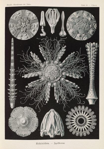
Shapes, patterns, shapes, patterns, shapes…PATTERNS!
One of the new elements that can be spotted on our website are “biology textbook” inspired patterns. They are profoundly organic, and with their raw and unfinished appearance, they challenge and contradict the flawlessness of the grids. In addition to being the most prominent graphic element in our design, they also serve as the carriers of the main message. Some are pretty straightforward to decode, whereas others are more abstract and leave the interpretation to your imagination.
The three R’s metaphor
In the spirit of the “reduce, reuse, recycle” ideology, we decided to “reuse” the website’s grid structure from 2021, influenced by brutalism. We aimed to discover a new way of presenting it instead of just wastefully “throwing it out”.
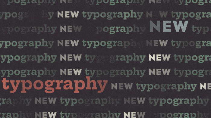
Taking a similar approach, we picked our typography direction — “serifs recycling”. Somewhat organically shaped glyphs were another criteria we set when searching for the primary font.
Even though we also selected a more unobtrusive sans-serif to pair it up with, the idea was for the serif font to play first fiddle in our design. This incited a lively debate in our team on: “Are serifs traditional or futuristic?” and frankly, we did not reach a conclusion that was unanimous. Serifs are definitely a thing of the past, but whether they will also become a thing of the future is up to us, designers. Serif fonts, just like other former trends, are making a comeback, proving that the future is not only shiny and silver, but sometimes hidden, lying still under the layer of dust.
More Inspo that fueled the design decisions