It’s always been there, Nigerian typography. It’s been lurking on the streets, mostly moving, most adjacent, never not working. It’s been fascinatingly a workhorse for the always eclectic emotions of Nigeria, the ever-bustling city of Lagos. Perhaps that’s why people miss it, its sublime integration into pop culture has almost made it invisible. Only recently, a handful of designers managed to capture lightning in a bottle, and they’re establishing what would serve as the foundation of Nigerian typography.
The Origin
Owing mostly to Eurocentric standards and the underdeveloped visual coherence ofNigerian design, it’s hard to really decide what is really deserving of rendition because of the stereotype of what is considered beautiful. We’ve been conditioned to relegate roadside sign painters and illustrators to be unprofessionals, meanwhile they’re the ones that really define what is culturally relevant to a city or place. The whimsical style of barbershop sign paintings, super stretched Arial or Impact type job vacancy posters or the meticulous Agbada embroidery are in themselves impeccable examples of culturally nuanced design styles in Nigeria. The act of unraveling and defining this beauty itself is what we’re trying to do with typography in Nigeria.
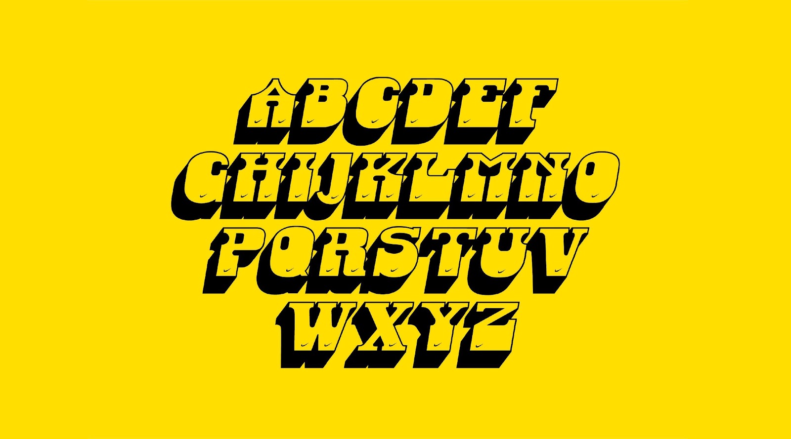
”I saw this for the first time in 2012. I had just graduated from architecture and wanted to do something nuanced. When we tried licensing a typeface for a brand identity project, I realized that Helvetica is very interestingly resonant with New York. It got me thinking, what’s the Lagos version of Helvetica.” said Olusanya Seyi, a partner in the Da Design design studio in Lagos. He and his team worked on the Danfo typeface that’s riddled the entire city of Lagos on public buses. “Interestingly, we’ve asked around, no one knows where they came from, but there’s a clear unspoken distinction on what they look like, how they were applied, and what constitutes the Danfo typeface”. Much like black letter typefaces, the Danfo typefaces possess distinct accentuation, hard drop shadows, and a recognizable, interestingly drawn Nike logo on the bottom of the letters. Seyi took on the challenge to make the characters into a typeface that’s publicly available. The reception has been so amazing, that Seyi has gone ahead to start Afrotype, an Afrocentric type foundry.
Danfo STD by Da Design Studio

Festac by Afro Type
Meet the Danfo and Faaji Typeface

Faaji Typeface by Eyeyemi
The Danfo typeface was the first of many more beautiful things to happen to type design in Nigeria. Dá’s work on the Danfo typeface seemed to open Nigerian designers eyes to the beauty that existed in Nigeria’s pop culture. I assume that’s what inspired Eyiyemi Elemea, a design generalist, to work on the Faaji typeface. Based on very similar fundamentals to the Danfo buses – the Faaji typeface highlights important typographic elements as the blobby letterforms, the slightly quirky loops, and the inconsistent finishes are what define the typeface. “We’re beginning to see a level of nuance with typographic qualities in Nigeria. We’ve found the baseline character, we’re currently exploring and making them more accessible, and importantly, we’re seeing them used in real life scenarios like the most recent Korty’s video.
Catching Lightning
Discovering Nigerian typography is one part, drawing the typefaces becomes a challenge, but I present to you the ultimate challenge – discovering, drawing and using a Nigerian typeface for a real Nigerian client project. That’s a great feat that the team at Belonwus has been able to surpass when they drew the (not yet named) typeface for the football club Sporting Lagos’ jersey numbering system as part of the brand identity for the club. “When we saw the typeface on a trailer, we immediately knew we were going to use it for a real project, we just didn’t know which one yet”, Joseph Adesiyan explains.
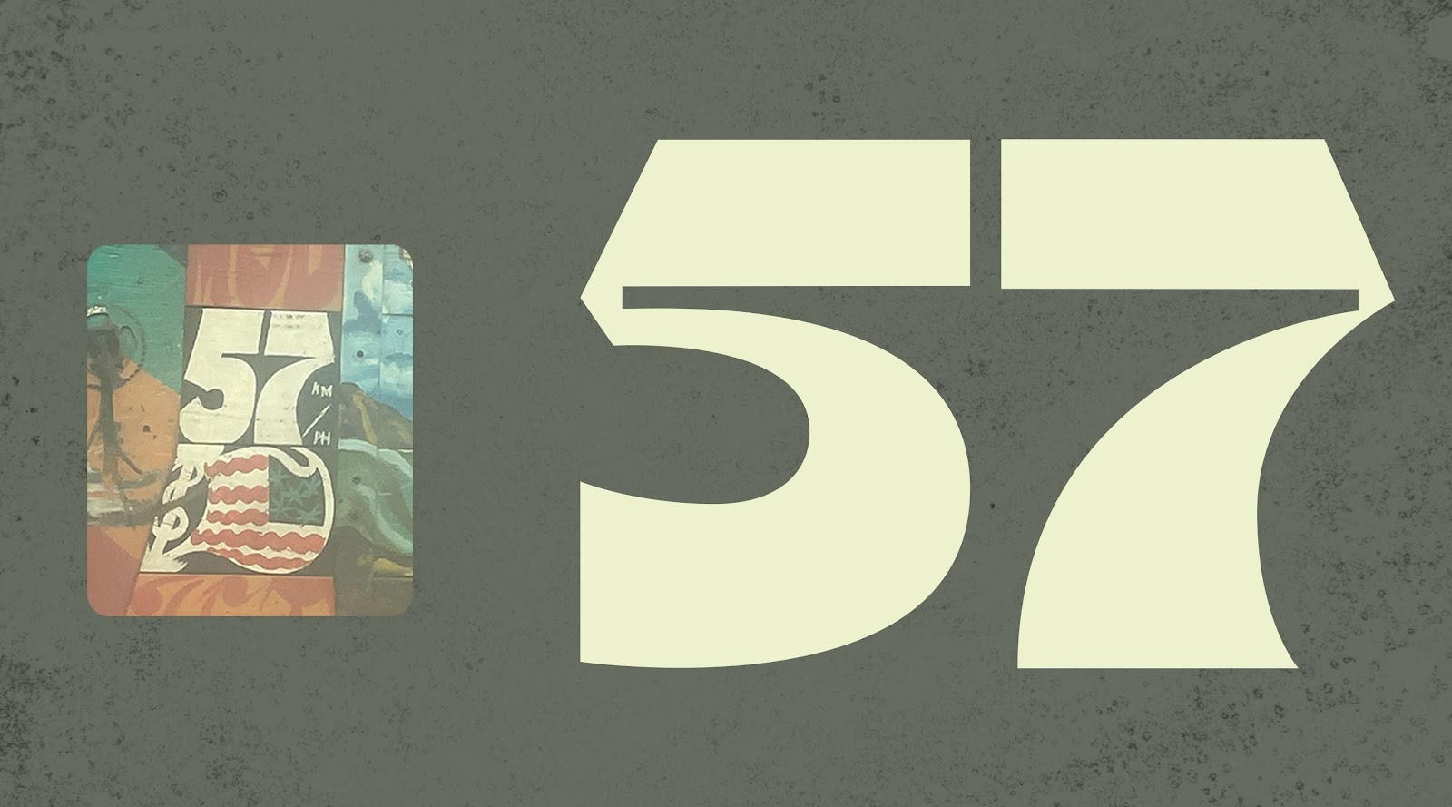
Untitled Sporting Lagos typeface Number by Belonwus
The trailer-painting-inspired typeface was discovered on a random journey around Lagos, and the number 57 (typically used to highlight the top speed the trailers could ride on) stood out. The fat chunky letters with wickedly interesting ink-traps set the tone for the typeface design. They started by designing the numerical characters specifically for the jersey numbering system hoping to extend it into a complete typeface. “Interestingly, we didn’t have any pushbacks regarding this integration as we would have thought, it’s about a year now since we’ve seen the typeface in practice and we’re in plans creating a condensed version to solve a problem of sizing especially with the shorts numbers.

Untitled Sporting Lagos typeface Number by Belonwus
What’s the future of type design in Nigeria? Nobody really knows. However, everyone is enthusiastic about the possibilities. The spirits are high, and with a growing number of individuals showing keen interest in Nigeria’s design aesthetics and budding communities like The Huddle and Lagos Meet are helping organize and articulate that enthusiasm. I believe the same way Afro beats has been packaged and shipped to the rest of the world and enjoyed globally, I strongly believe Nigerian design is currently the next on the conveyor belt, and type design is playing an integral role and ensuring this happens correctly.
* * *
Jordan will give a talk at the digital design conference Design Matters Lagos 23, which will take place in Lagos City, Nigeria & Online, on Nov 15 and 16, 2023. Get your ticket here! And if you want to connect with Jordan, find him on LinkedIn, Twitter, or visit his website.