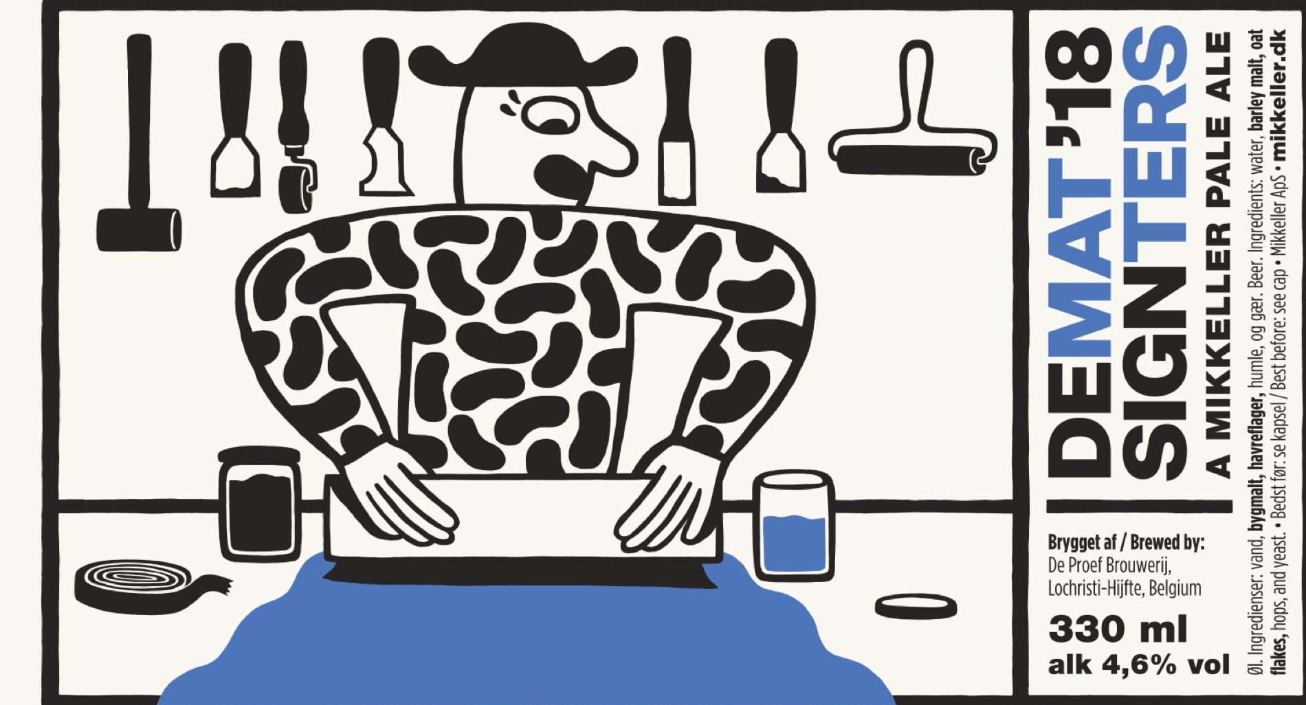

Mikkeller Brewery will launch a very special beer for Design Matters 18 — and we can’t wait to taste it! While we wait, we have asked Art Director Keith Shore about how he entered the world of designing beer labels and came to illustrate an entire brand.
When you did your first Mikkeller label in 2010, it looked a lot different from other beer labels at the time. Why did you design it like that?
I wasn’t a beer fanatic. I wasn’t influenced or really even familiar with what was happening in that world. I guess looking back that was somewhat of an advantage for me. I wasn’t hired on to refresh the brand or shake things up –
I was merely given a freelance job to make one label, no plan or promise for more work after that. Mikkel [the co-founder of Mikkeller] gave me a lot of freedom right from the start, and I think that’s a big reason why I’ve had success with it… I’m making art that I want to make — it’s been eight years now, and I’m still having fun with it!
Can you take us through the process of designing a new beer label?
I get some general info about the beer — the style, the abv, the format (size of the bottle or can), and usually the name (if not, we will make some suggestions). If time allows, I like to start with a super loose pencil sketch. This helps me imagine the compositions and pose of the characters. Then I’ll take a phone pic of it and bring it into Illustrator and redraw it and work out the palette and typography.
What do you think a good label should do?
Make you stare at it. Make you want to pick it up and spin it around to see the full story. Make you want to crack it open and drink it. It should help add to the experience of enjoying the liquid inside.
What has been the most challenging and fun experience, while creating the Mikkeller universe?
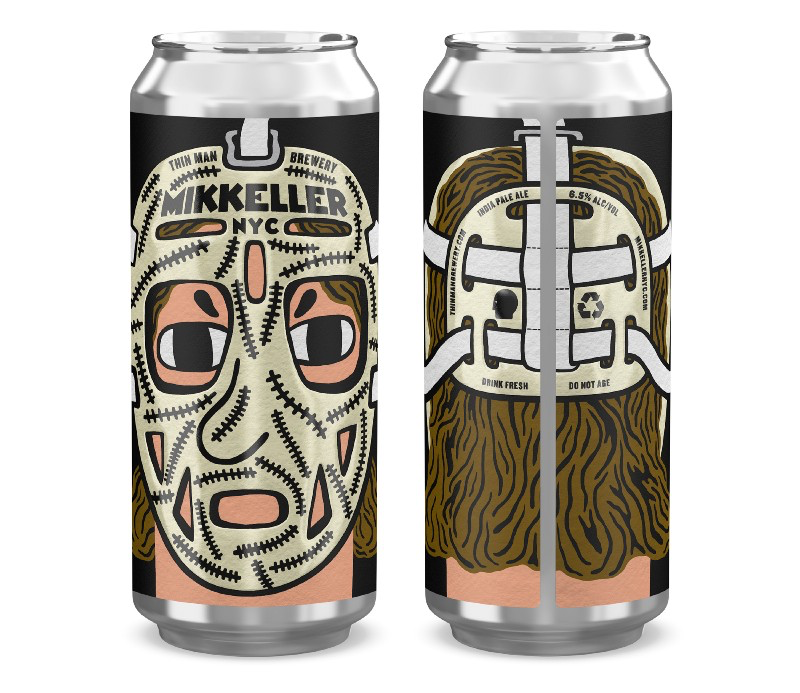
Keeping up with the growth of the brand. It’s just myself and our designer Ben Kopp working in my small backyard studio… there is never a slow day — we are always wildly busy with crazy projects. But this is no complaint — I love the Mikkeller universe and feel very lucky to draw these characters every day. We have worked on countless collaborations with inspiring musicians, chefs, filmmakers, clothing designers, airlines… and all in the name of beer.

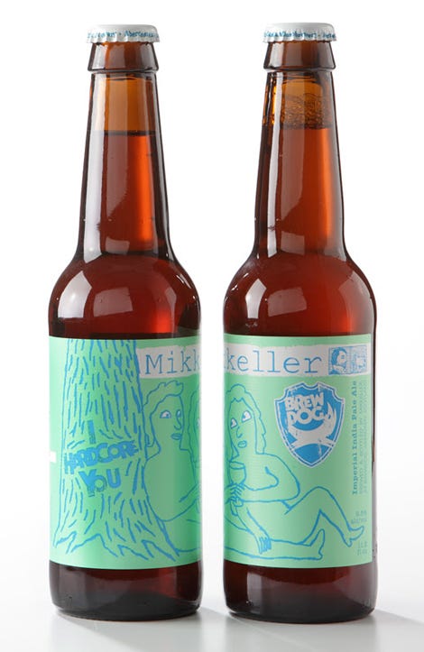
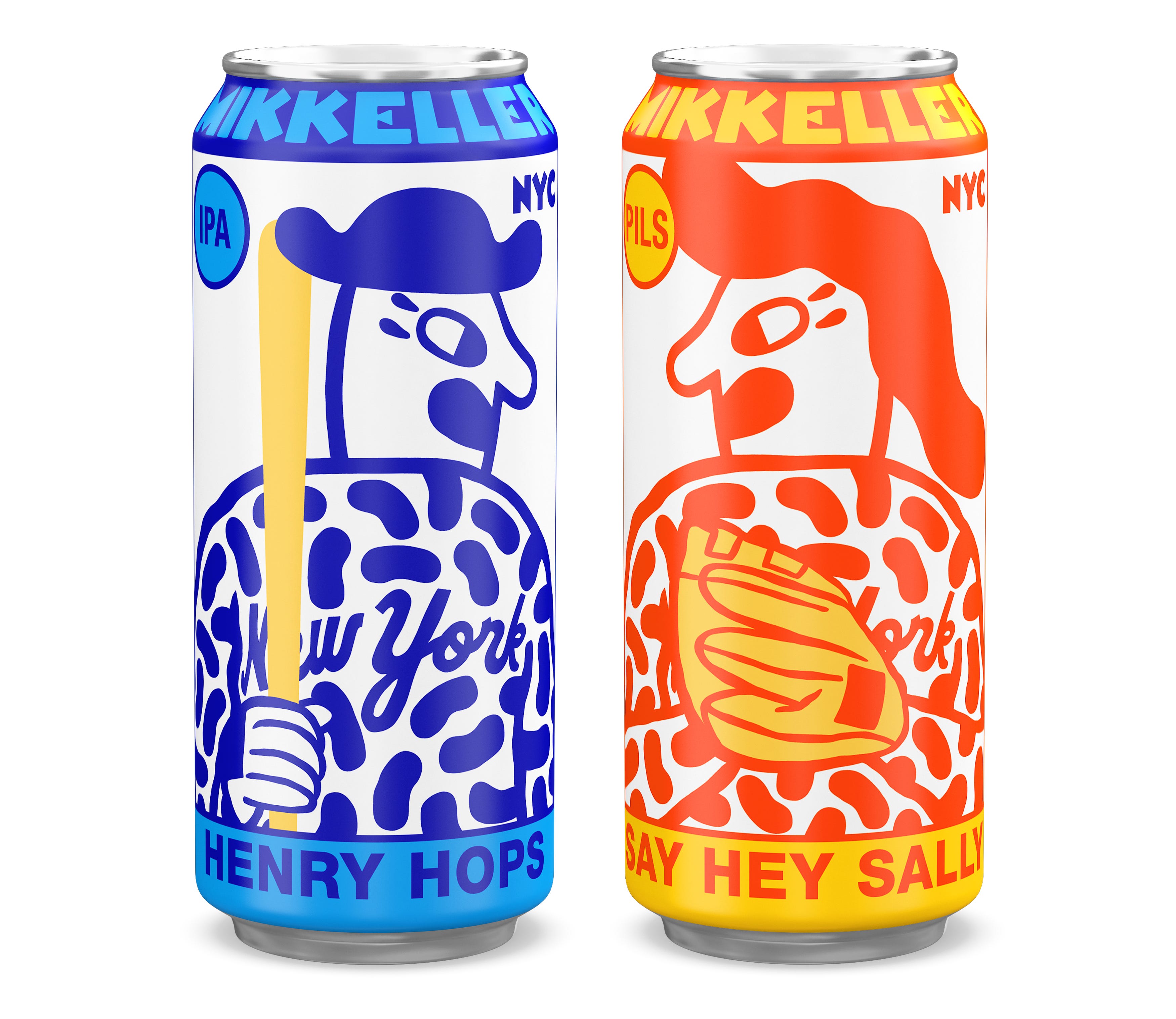
What is the story of Henry and Sally — the characters on the labels?
They are our hop sniffing, long-nosed lovers and each label share a piece of their story & adventure together. Henry has his shapely hat, and Sally has her bubbly hairdo. I started drawing these characters a few months before my first job with Mikkeller — just in my sketchbooks — and they organically became the face of the brand as time went on.
Have you ever had a label rejected, and if so — what did it look like?
Not for any interesting reasons. Just boring TTB regulations like drawing a still life with a fruit that wasn’t actually used to brew the beer.
Of all the labels you’ve designed for Mikkeller, do you have a favorite?
We released a series of labels with Domino Records. I Worked closely with some of my favorite bands to create the artwork — that was a ton of fun.
If you want to get a taste of Keith Shore’s design, come drink a Mikkeller beer with us at Design Matters 18 in Copenhagen!