
Tara is a sales and marketing strategist at Terra, driving client success with her love of copywriting and brand development.
Ten years ago, a marketing agency called Longneck & Thunderfoot sprouted from a single desk in the Columbia University Startup Lab in the heart of New York City. Over the next few years, one desk became five, then a whole office. Then another office — this one in Bilbao, Spain. The company expanded to offer design and web development services, and its name was streamlined to simply Thunderfoot.
Every day since then, we’ve sought new opportunities to become the best at what we do. Today, we’re an award-winning team of 50 creative professionals around the globe specializing in all aspects of digital marketing. Our client roster includes titans like Airbnb, the United Nations, AXA, and Healthline, and we intend to only grow further from here.
That is the evolution of our agency so far: a decade of growth from humble beginnings, built on an ethos of tenacity and hard work. For the next decade, though, we have decided to try something new. Something bolder and faster and smarter than our iterations to date: an identity that puts us on the global map.
This is the story of our agency’s transformation from understated to unmistakable.
Aim for the Wow
The now-retired Thunderfoot visual identity was adopted in the Summer of 2020. Speaking without any bias — I wasn’t even employed by the company yet — it was a work of art.
Drawing on deeply minimalist techy themes, Thunderfoot’s branding celebrated the recent growth of our web design team, The eccentric pastel color palette was boldly displayed in 3D rendering linework against a jet-black base color, a style that reflected our boundless capabilities in the digital space. We could identify as more of a boutique agency at the time, and the visual brand communicated the intricacy and subtlety of the strategies and services we delivered to clients in multiple niche industries.
In the years since launching the Thunderfoot brand, we have been fortunate enough to experience consistent growth, doubling our client roster and expanding our team to its now-global footprint. As our presence expanded, though, cracks started to show in our own brand and marketing efforts.
In March 2023, a small group of designers, developers, and team leaders convened to investigate. A top-to-bottom audit quickly revealed the cause: growing pains. We had simply outgrown the brand and name we had known and loved for so long. They no longer communicated our expertise and ambition, and instead felt unnecessarily limiting to our creative team. In order to continue growing, we would need to make a big change.
We were now at a crossroads, staring down an opportunity to determine the future of our organization: evolve the existing identity of Thunderfoot, or transform into something entirely new.
It’s worth pausing briefly to analyze how brand refreshes and rebrands, while often used interchangeably, represent two very different philosophies of change. Evolution is about building upon legacy, refining with intention, and leveraging wisdom gleaned from a decade of experience to navigate a forever-shifting landscape. Iterating on Thunderfoot would stand as a testament to our resilience, allowing us to adapt without losing the foundational identity we’d worked so tirelessly to build.
Transformation, on the other hand, is a radical and immediate reinvention, offering untapped possibilities in exchange for a departure from the path that got us to a certain point. Moving beyond the Thunderfoot brand meant breaking free from any pre-established boundaries that could tether our potential, while also catapulting us into unknown terrain.
So, there we were, trying to decide whether to rely on where we’d come from, or take a leap of faith based on where we were confident we could go. Ultimately, our decision was inspired by American graphic designer Milton Glaser, known around the world as the creator of the original I Love New York logo:
“There are 3 responses to a piece of design. Yes, no, and WOW! Wow is the one to aim for.”
Yes, perhaps it is a bit cheesy. But at the end of the day — be it too slow, too incremental, too inconsequential, or some combination thereof — evolution simply doesn’t wow anyone. So, with renewed enthusiasm and a healthy dose of nerves, we began preparing for Thunderfoot’s moment of radical transformation.
The Process of Transformation
As excited as we were to break the rules, blaze a new trail, and color outside the box, there had to be a method to the madness. Here’s a peek into what that method looked like:
Thunderfoot’s Pre-Postmortem
Yes, rebranding meant leaving the much beloved identity of Thunderfoot behind. But like a phoenix rising from the ashes, the best parts of our organization would endure in the new brand. We spent a lot of time studying Thunderfoot’s design history, tracing back to the inception of Longneck & Thunderfoot. Through this analysis, we identified where branding decisions eventually became marketing constraints, and we leveraged this insight to forge a more robust new identity.
Stakeholder Interviews
Next came interviews and discovery calls, starting with our two founders and Managing Partners. From there, we met with team leads, senior employees, new hires, and operations employees. We wanted to achieve a 720 degree perspective of Thunderfoot — that’s an initial 360 degree view, plus an extra spin for good measure — to understand how aligned the current brand was with the founders’ ideals for the company. More importantly, though, we wanted to hear what Thunderfoot meant to the team that embodied it.
North Stars
When rebuilding a brand from scratch, extensive and expansive intake and interviews are vital to nail the north stars: the core messages and expression of a brand’s values, mission, and vision for the future. It’s true that nothing is ever written in stone, but we agreed to do everything we could to ensure the new brand started out on very solid footing. We spent hours of conversation reflecting on life’s biggest questions: “Who are we?”, “What is our purpose?”, “Who do we aspire to be?”. Thankfully, we only had to answer on behalf of the agency.
Design Brainstorming
Finally, the fun part! Armed with a comprehensive review, our design managers stepped up to lead several weeks of brainstorming sessions to bring the new identity to life. Colors, words, photos, typography, shapes, vibes — anything and everything that inspired us was pinned up on mood boards. Promising concepts were distilled into stylescapes and personality triangles. From there, two promising candidates were selected to develop further into proofs of concept and face off in the contest to become our agency’s new brand.
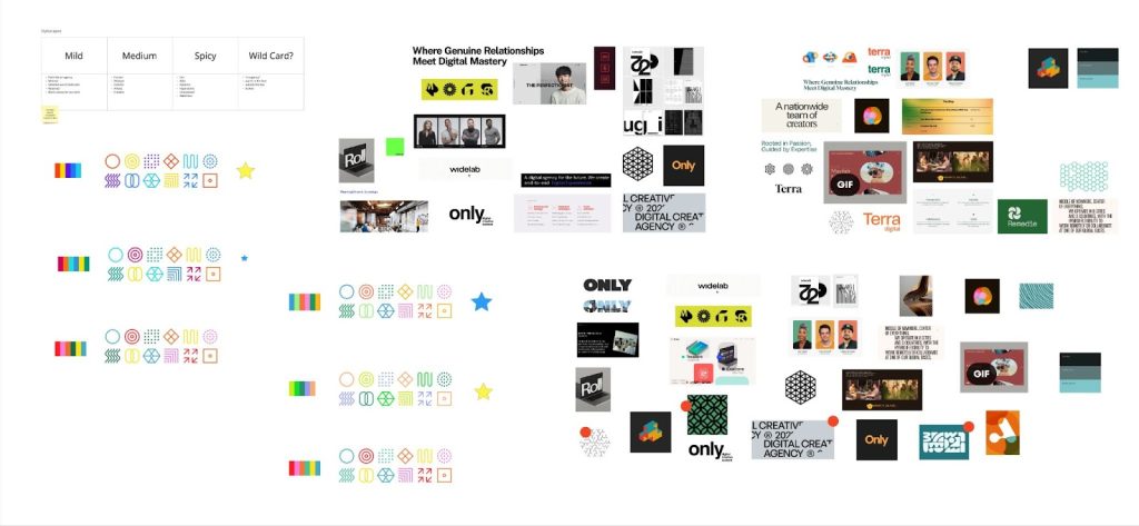
Stress Testing
Before making any commitments, each identity had to prove itself in a real-world environment where we could gauge its efficacy and impact. That meant mocking up everything from websites to baseball hats. Each brand was fully developed, and it was through this process that the winner became all too obvious.
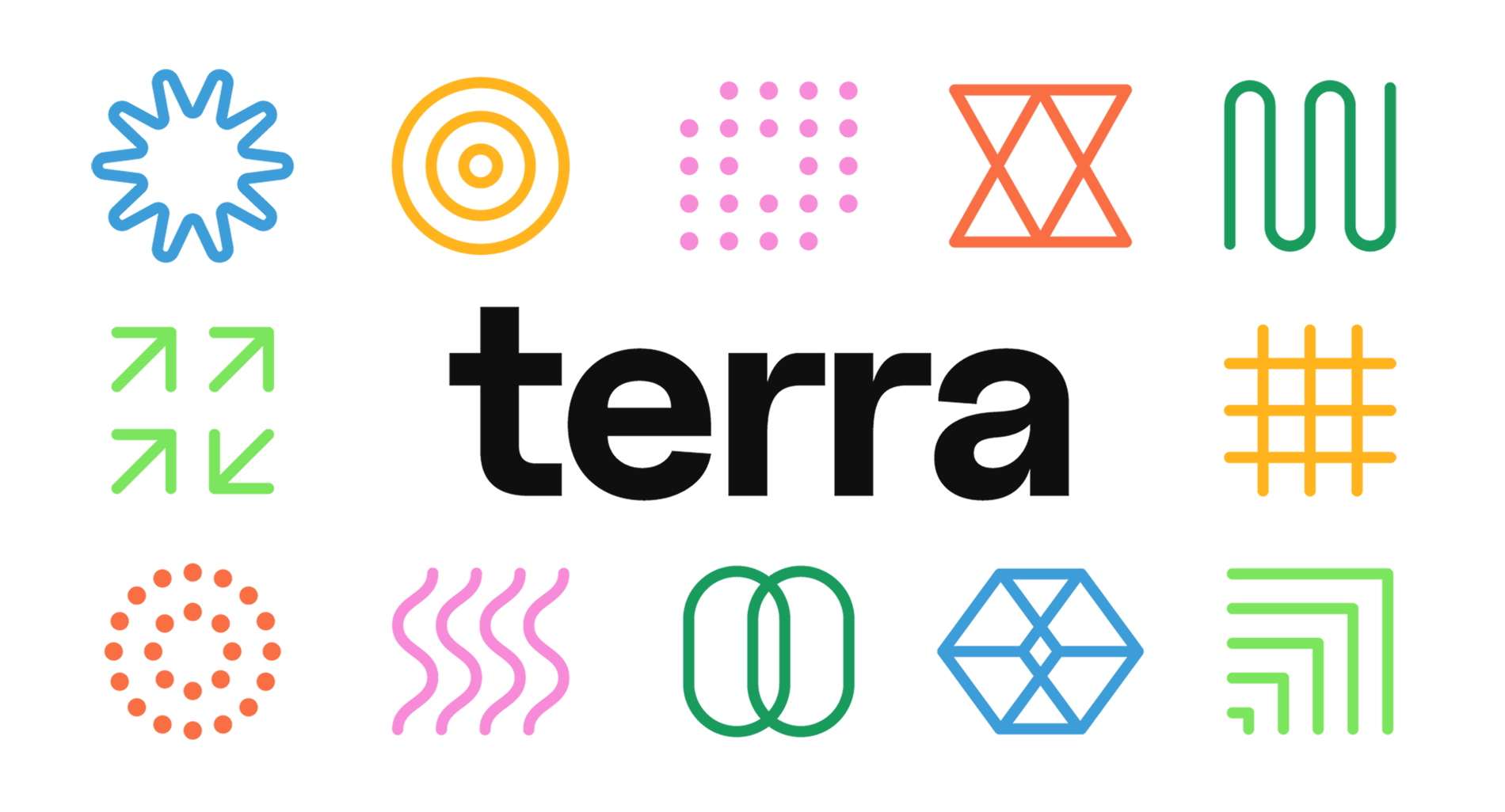
Introducing Terra: Where Genuine Relationships Meet Digital Mastery
What’s in a name? Everything — especially in ours. Terra is a global word, originating in Latin and present in nearly every language. It communicates our reach. It unifies our team. It offers a bevy of opportunities for puns. It is — again, speaking without any bias — perfect.
Terra is three things: human, adaptable, and expert. Take a look at some of our brand elements and you’ll see exactly what I mean:
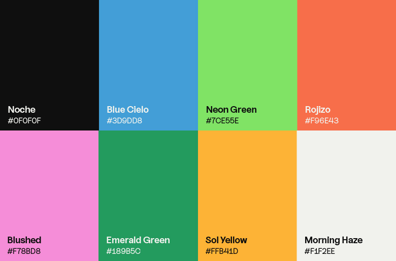
Color Palette
It’s exciting, but not playful. Modern, but not contemporary. The Terra palette interweaves six avant-neon colors to produce a dynamic visual experience. Keeping the boldness in check is a foundational off-white and off-black that we strategically pair with the six-color set in our branded iconography and patterns.
Typography
Enter Uncut Sans, our chosen typeface. This grotesque sans serif perfectly complements the off-beat palette. While legibility makes it a practical choice, its unique letterforms infuse a personality full of confidence and smarts. Its features, like the eccentric counter of the lowercase “a”, make every headline a bold headline. Plus it’s a Sans font, so we’ll never find ourselves without it.
Voice
One of the more unique elements of our brand identity is the adoption of an interlingual brand voice, which speaks to our global team’s pride in communicating and collaborating across borders. Our differences and diversity are core strengths, but Thunderfoot’s identity was too sleek and techy to ever dare to incorporate them. Now, everything from our internal Slack channels, to our website, to even stickers and swag represent the rich, diverse cultures of our team.
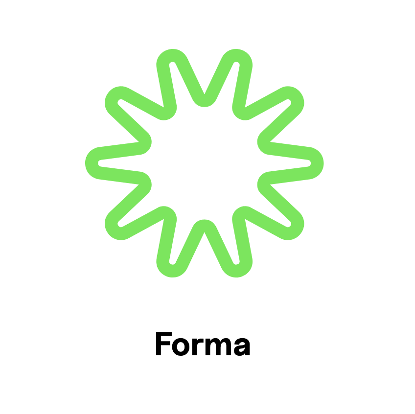
Terraforms
Finally, there are the Terra brand’s crown jewels: the Terraforms. Our logo is actually a maximalist series of 12 interchangeable symbols, each one representing the unique capabilities and values of our agency. Each Terraform also brings with it an individualized meaning and part of our story, and those who look closely will quickly spot hidden narratives across the Terra brand universe. But here’s the coolest thing of all about the Terraforms: they’re as adaptive and collaborative as our own team, coming together in a logo that captures the essence of an agency primed for any challenge.
A Moment of Gratitude
Terra is not a rebrand; it is a transformation. We turned the core of what was already a promising company with a bright future into the foundation of a team and company so incredible, its full potential is yet to be recognized.
What we do need to recognize, though, is our immense gratitude for the people that Terra represents. Each member of the Terra team inspired the identity we are introducing to you today. And that leads me to a final, very important point. Becoming Terra isn’t about a sudden surge of talent or ability. It was a shift that allowed us to correctly showcase our essence. We’re humbled and honored to have created an identity that finally reflects the talented team that embodies it.
So, we now move forward as Terra. And we do so with the excitement of knowing that if we can dive in and define our own story with such passion and precision, then we can bring these same talents to our clients’ brands and projects.
* * *
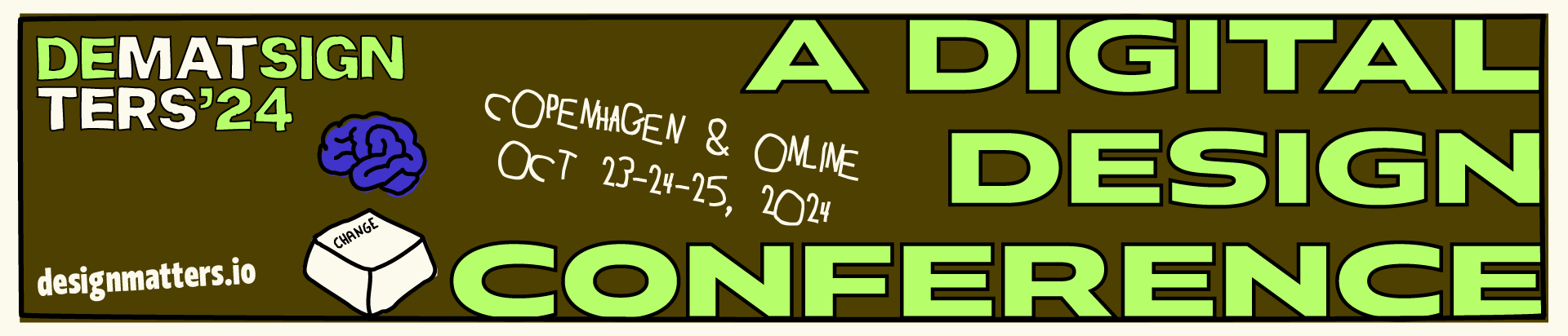
Do you want to know more about this rebranding process? Mercedes Lorenzo, Creative Director & Andres Clua, Director of Technology at Terra — formerly Thunderfoot — will give a talk at the digital design conference Design Matters 23, which will take place in Copenhagen & Online, on Sep 27-28, 2023. Their talk, titled “Creativity and Process: A Love Story”, will explore how introducing a design system and global components can save us time and avoid repetition while exploring new and exciting strategies in our design practices. Get your ticket here! Follow Terra on LinkedIn, Instagram, or visit their website.