SPONSORED CONTENT
Find the original post here.
Shopify is an all-in-one commerce platform that helps users start, run, and grow a business. Offering online retailers a suite of services including payments, marketing, shipping, and customer engagement tools, Shopify powers over 1,000,000 businesses worldwide. From 2016 to 2019, businesses on Shopify contributed $319 billion in economic activity worldwide.
Polaris by Shopify is an open-source design system that helps create a consistent user experience for merchants. The system consists of a set of guidelines and principles which designers can use while building apps and channels for Shopify. Polaris provides resources and building elements, holding all the building blocks needed to create apps that will feel familiar to merchants. It also allows partners to download a style guide, a library of components and patterns, as well as a UI kit they can use.
Yesenia Perez-Cruz, Senior UX Manager at Shopify has written this article for Shopify.

A lesson that we’ve learned at Shopify from building Polaris is that maintaining a system takes more effort than building it. That’s because design systems inevitably create debt. Components will be used and forked in unpredictable ways. Dependencies can make it difficult to predictably make a change. We ran into these issues while rolling out a new design language for Shopify’s admin in October. The time it took to test the impact of a small visual change across the product slowed down the rollout.
Looking at Sparkbox’s 2020 state of design systems survey, I see these same pains reflected:
“42% of in-house respondents felt that the way their design system was originally built created debt for the organization’s technical or design departments.
When we asked how building the design system created debt, the two top responses were both related to a planning failure.”
It reminds me of this story about the cost of maintaining paved roads. Some towns are turning their paved roads back to gravel to save money. The benefit of paved roads is that drivers can get to where they want to go more quickly. But maintaining and repaving roads is expensive. And driving on a well-maintained dirt or gravel road can be better for cars than crashing through potholes.
The moral is: investing in infrastructure is worth it, if the benefit to people is worth the cost of maintaining the infrastructure. Ultimately, like paved roads, we create design systems because we want to help users accomplish tasks more easily. We lose sight of this when we focus too narrowly on design systems as a tool that helps internal teams move faster. A design system that allows you to efficiently ship a confusing user experience has no value.
If we want to enable better user experiences, our current design system foundations aren’t enough. We need an experience foundation.
The value of an experience foundation
When you think of design system foundations, you probably think of design, UI, code, and content elements that teams use to build more efficiently. All of those elements are present and used heavily in Polaris today. The Polaris team had been focusing on making those elements better, and we’d probably still be doing that today. However, 2020 shifted those plans.
In April, the Polaris team paused all of our existing projects. We embedded with product teams for two months to help ship COVID-priority projects. We’d thought of a design system as a tool that scales good UX decisions, but using the system alongside product teams revealed:In April, the Polaris team paused all of our existing projects. We embedded with product teams for two months to help ship COVID-priority projects. We’d thought of a design system as a tool that scales good UX decisions, but using the system alongside product teams revealed:
- Decisions have a shelf-life. A decision may have made sense when it was added to the system, but may no longer be the best solution.
- Decisions may not feel clear, especially for people that joined the company after those decisions were made.
- Decisions without clear rationale can feel limiting, especially if they’re blocking you from solving a UX problem.
Further, while some product work should feel fast and efficient, at other times people need to reflect. They need to understand if a solution in the system works for them, if they should challenge it, or if they should create something entirely new.
So we asked ourselves:
- What if instead of just scaling decisions, we could also scale the rationale that led to those decisions?
- What if instead of just enabling fast work, systems could also enable reflection and understanding?
These questions led us to create an experience foundation for Polaris.
The elements of an experience foundation
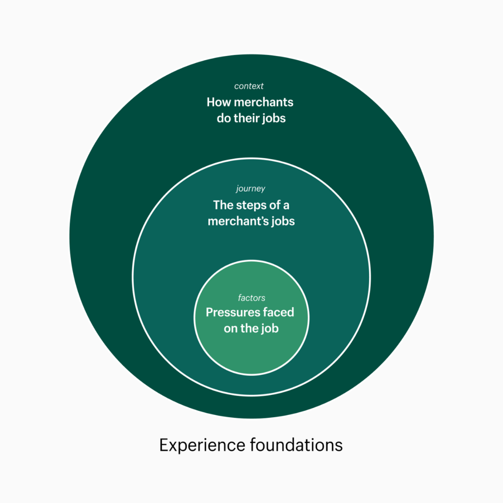
An experience foundation is a framework that breaks down our understanding of user problems into modular, interconnected elements — the same way we break down our UI into modular elements.

It’s made up of:
- A merchant’s job, expressed through a journey;
- How they do the job, expressed through context;
- The pressures they face on the job, expressed as factors.
Journeys are the steps users take when they interact with Shopify to do a job. Even if your product team is organized into distinct feature teams, your users shouldn’t be able to see those organizational seams as they’re getting work done. Mapping a user journey has helped Shopify teams, like Billing, spot where siloing was leading to a lack of cohesion.
Context describes the circumstances surrounding a user: the who, what, where, and how. Context provides the rationale behind the decisions in a system, which allows teams to use, modify, or evolve the system with confidence.
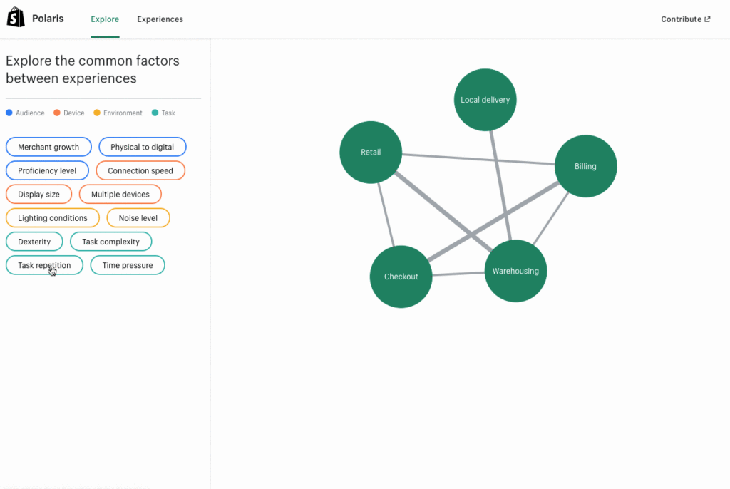
Factors are the changing conditions shared across experiences that impact a design. We discovered that teams could be solving for different audiences in different environments, but land at similar solutions. For instance, Retail, Warehousing, and Driving experiences all have scaled up UI elements, larger typography, and less UI on the screen. If teams have similar solutions, it’s likely that they share factors.
We knew we needed the experience foundation documentation to be concise and modular. Concise, because people aren’t going to read pages of long-form text, especially in 2020. Modular, so we could cross-link insights across local system documentation.
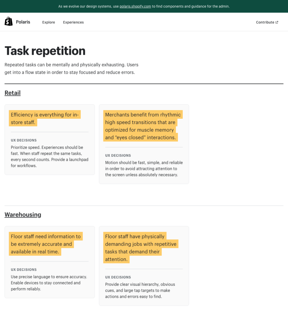
We solved for those goals with modular insight cards and factor tags. Each experience has 3–5 insights. The insights are basically summaries of a team’s understanding of their user’s context and how they informed UX decisions. Insights are tagged with factors and each factor has its own landing page which gathers insights and decisions from across local systems.

The first version of the factor pages will have insights and decisions, but we see this evolving into an advanced search that helps teams find system assets across local systems. This will also serve as a research tool for the Polaris team. As we collect more information around the most common factors, we can adapt the foundational elements to better serve those factors.

These modular elements will change as our understanding of our users evolves. That also means we can replace elements if the conditions change concerning how merchants do work.
This site is currently only for internal users, but we plan to release it externally next year. Eventually, we plan to have one site for Polaris that will have both internal content and external content and resources for our partners and outside audiences.
Evolving the role of the Polaris team
As Shopify has grown, the role of the Polaris team has also changed. The Polaris team used to rely on deep expertise in admin experiences. By broadening our scope, we can no longer rely on our own deep knowledge. We need to think laterally and enable other teams to share their deep thinking so everyone can benefit. Product teams have a deep understanding about what makes their audiences unique and what types of factors they’re designing for. While product teams think deep, we need to think laterally.
A lot of the work we do is guiding teams to identify the user insights that should inform their local systems and spotting interconnections.
This may sound very different from the design systems work you’re accustomed to. And don’t get me wrong, the foundational component work that we do is still important and also needs evolution. We recently built a themeable color system, which was a big step in adapting our visual foundations. But this experience foundation will help us identify how we should invest time into evolving the foundations.
Enabling greater visibility allows us to spot patterns. That allows us to enable networked thinking and reduce duplication, which will empower us to evolve the foundations with confidence.
Repaving roads is expensive. I’m cautious of continuous paving and repaving that could feel like short-term progress (and keep a systems team busy), but actually takes longer to meaningfully improve the user experience. Our greater understanding of user problems will help us pave the right roads.
Thank you to Hayley Hughes for the thoughtful edits on this article.


