
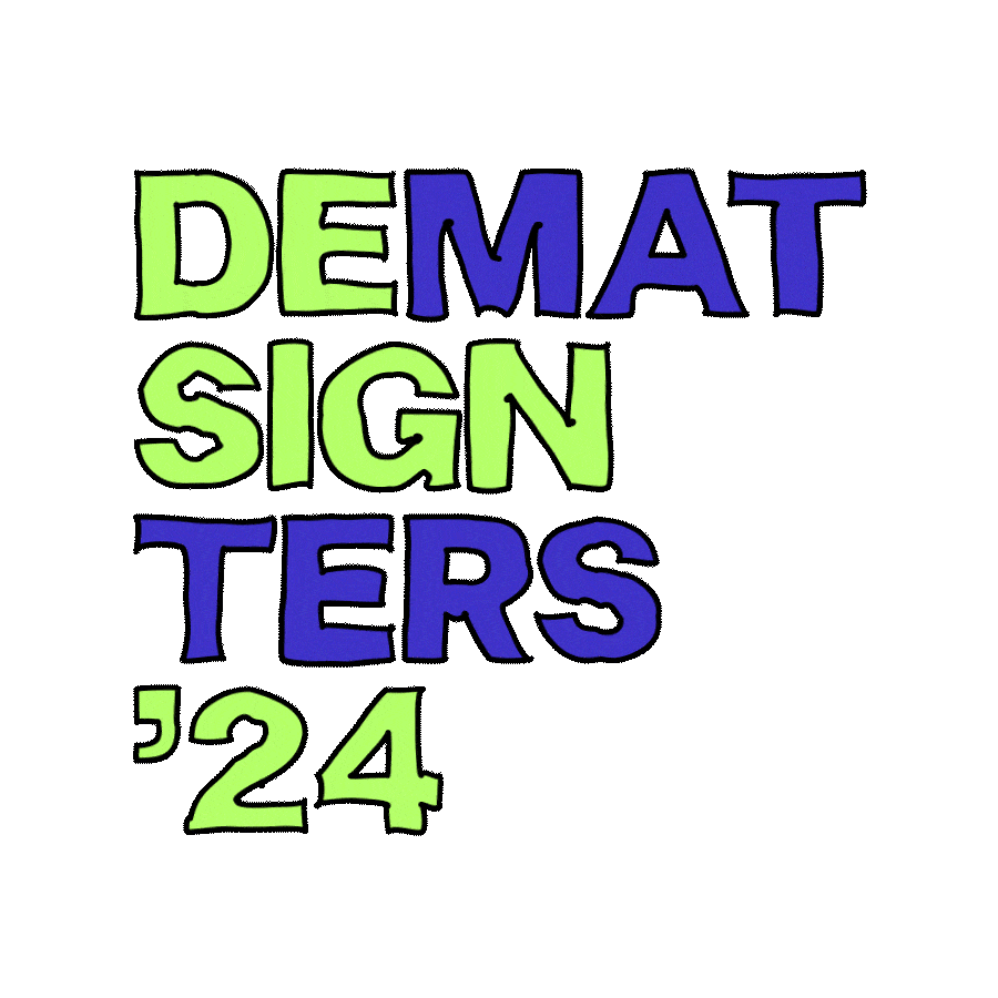
Our 2023 digital space mission is nearing its end; we’re ditching the space helmets for party hats and feather boas. Why? 2024 will carry in the theme of the celebration. Not only are we celebrating Design Matters’ 10th anniversary, but all the creatives – with this new identity exuding playfulness, joy, and a touch of childhood innocence. We’re no longer levitating in space surrounded by glitching retro fonts and AI, and instead, we’re keeping our feet firm on the ground, ready to immerse ourselves in an exploration of our inner child.
From the pen of a 10-year-old
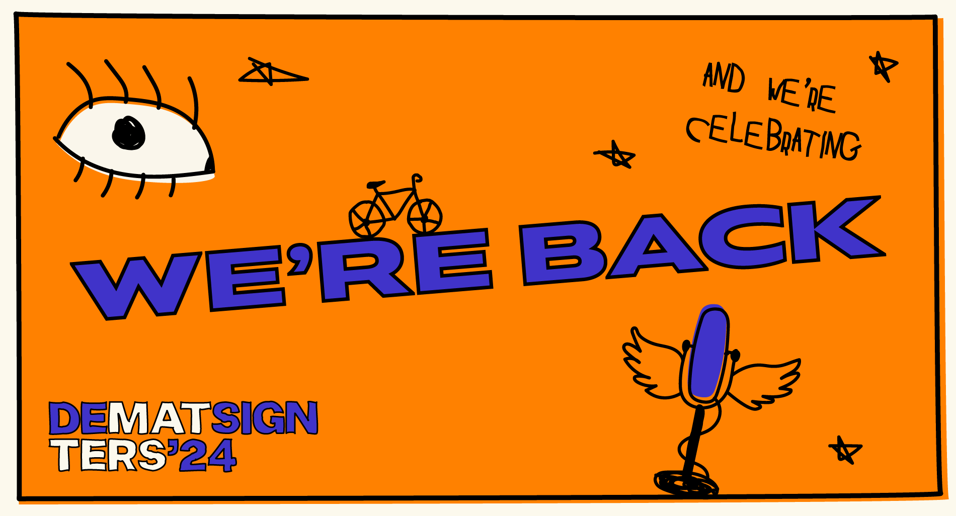
Doodles and squiggles. Hasty and infantile cherry on top of a birthday cake. That’s one way to describe the illustrations that were cast as the lead in this new visual concept of ours. With their crooked appearance and colors leaking through the edges, they seem as if they were scribbled on the margins of a textbook or carved into the desk in a math class. What makes the difference here, however, is that they are animated in a subtle but jittery way to make them more dynamic.
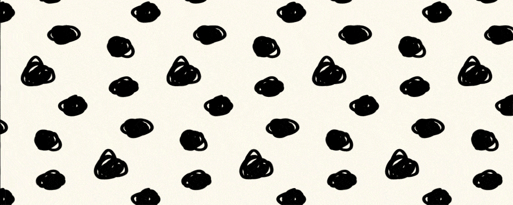
Another component of this visual identity under the category ‘playful and decorative’ is patterns. In the same spirit as the animations, they have a ‘crafty’ quality about them. Dots and lines might seem like the easiest shapes to draw…but are they?
The role of these prominent graphic elements is to garnish the design, sure, but also to let us reminisce about childhood and to radiate authenticity while embracing imperfections.
Back off, black!
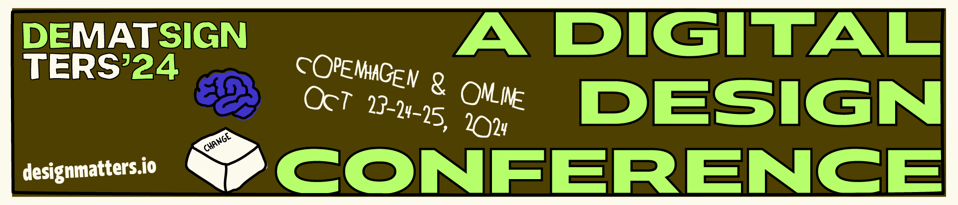
Lightness and optimism; two keywords we kept in mind while selecting our new color scheme. They led us to a rather radical decision: to drop the black background on our website we were so faithful to in the previous identity, along with the mystery that comes with it. The only area where the black survived is the text color, to create the desired contrast with the bright background we went for in this new visual identity. To slightly numb the sharpness of a pure achromatic white, we tweaked the values to achieve a milder off-white hue.
It wouldn’t be a celebration if we didn’t throw a few more colors into the blend now, would it? We mixed cold and warm, dark and light colors. The palette consists of the very refreshing ablaze inchworm green that draws most of the attention, which we used to our advantage, the fiery festive orange, the rich ocean blue and a more ‘down-to-earth’ dark bronze. Quite a party mix!
A potpourri of design elements
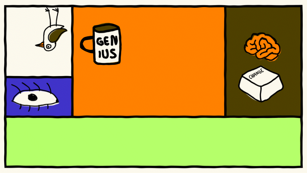
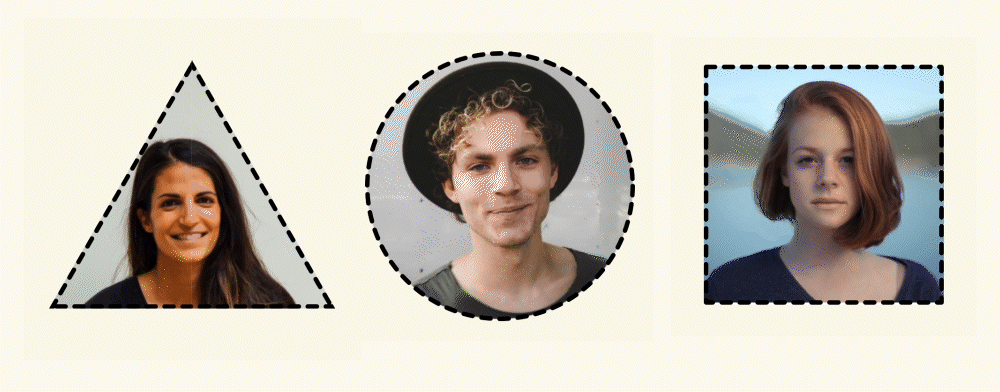
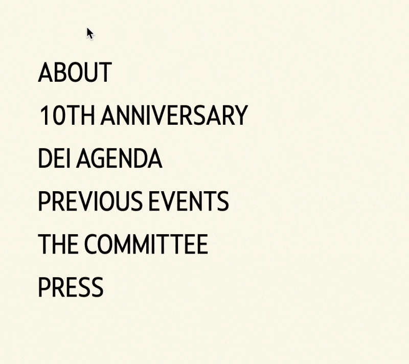
When brainstorming the new identity to go for, we were asking ourselves questions like: Should we go for brutalist order or playful chaos? On one hand, the edgy oversized buttons, strong outlines, geometric shapes and sharp rectilinear edges unmistakably make the website appear rough but put together, and on the other, it looks as if an earthquake struck, and the screws on some of the elements got loose. Images, titles, buttons, input fields, they are all tilted and paired with the crafty hover effects and hand-drawn components, they add a dash of playfulness to the design.
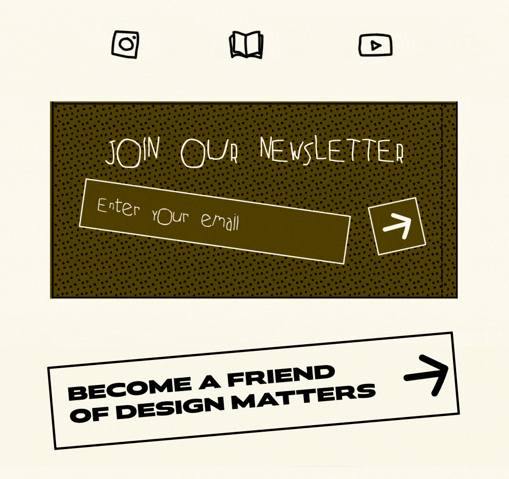
Moreover, if you feel like letting your creativity loose while scrolling on our website, you can do that too; we implemented an interactive cursor feature that allows you to draw and doodle while reading about the conference themes.
It must be MAAGic!
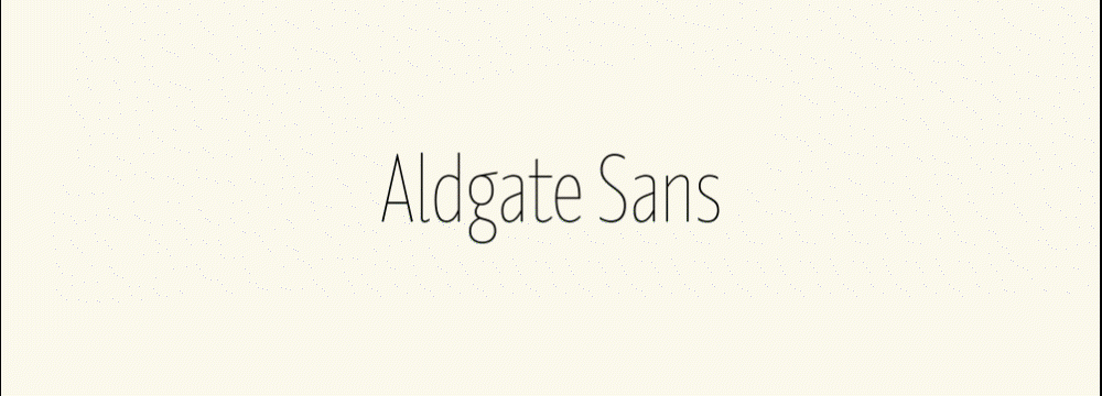
Design Matters might be turning 10 already, but if there’s one thing that never gets old, it’s variable fonts. Their ability to smoothly transform (whether to shrink, expand, bulk up, melt…one wouldn’t believe what they are capable of) has a way of making every digital interaction at least 20 times better. Our infatuation with them started with Arillatype’s At Amiga in the previous identity and turned into a full-on obsession with the discovery of Dalton Maag’s Aldgate Sans.
Dalton Maag is a renowned typeface design studio, and we were privileged enough to welcome one of their gifted creative directors, Zeynep Akay, on stage in this year’s edition of Design Matters in Copenhagen. Zeynep took us on the adventurous journey meticulously explaining, from A to Z (literally), how the typeface is made. The talk only confirmed Dalton Maag’s undeniable expertise in ‘everything type’ and assured us that they are the ideal candidate to strike up a collaboration with. Thanks to Zeynep, who was generous enough to agree to it, we can now proudly say that Aldgate Sans is officially a part of our brand kit for 2024. Aldgate Sans, one of the newest additions to Dalton Maag’s font library, is a sleek, stylish and perfectly legible sans-serif typeface. Similarly to its predecessor from 2023, the beloved At Amiga, it’s also a variable font, and we made sure to use its ‘shapeshifter’ characteristic on our website.
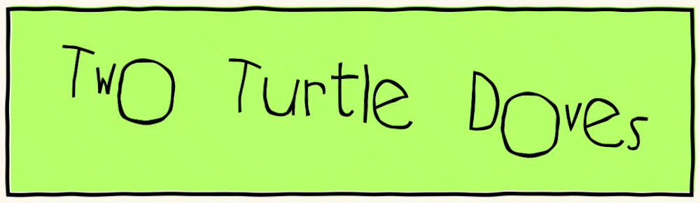
What do you get if you mix turtles with doves? A quirky handwritten font with crooked glyphs and a lot of attitude. Two Turtle Doves will become Aldgate Sans’ comical sidekick in 2024. Its almost ridiculous appearance serves as a reminder that sometimes it’s okay to drop the serious act and just chill out. If this typeface had a label, it would say: “use with caution and just enough to transmit a touch of playful character to your design”. It’s dangerously exuberant!
Oh, designers just wanna have fun
Otherwise, what’s the point? The new visual identity is a nod to the playful aspect of the designer’s job – generating silly ideas, making drafts that suck, making drafts that suck less, all while goofing around and being unapologetically creative – an aspect that deserves to be celebrated.
So, dust off the mirrorball and pop that champagne because Design Matters is turning 10 and throwing a party! And you’re invited. Don’t forget to RSVP!
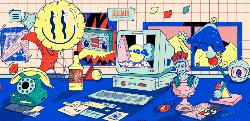
Inspiration
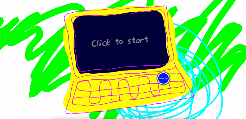

tilted elements, playful interactions
buttons, playful interactions, typography
tilted elements, hand drawn icons, outlines, playfulness