
SPONSORED CONTENT
Social Media has become an important part of growing a brand. But getting the most out of your brand’s social presence is not easy, and it becomes overwhelming very quickly – there are dozens of channels, thousands or even millions of followers, countless comments and posts. That’s why many companies need a tool to help with all that. Falcon.io is such a tool. As an industry leader in Europe and fast-emerging in the U.S., they are a platform for social media listening, advertising, engaging, publishing and analytics.
In this article, written by Andrius Knispelis, Senior Product Manager of Onboarding at Falcon.io, you’ll learn how recent changes in Falcon’s go-to-market strategy has affected the way they design their product.
Like most SaaS companies, we got where we are now by perfecting the traditional sales funnel – going from awareness, to interest, to sales demos, to closing a deal, to up selling, and then making sure clients don’t churn on us. It works best for targeting high lifetime value customers, justifying the cost of all the human interaction that Falcon puts in.
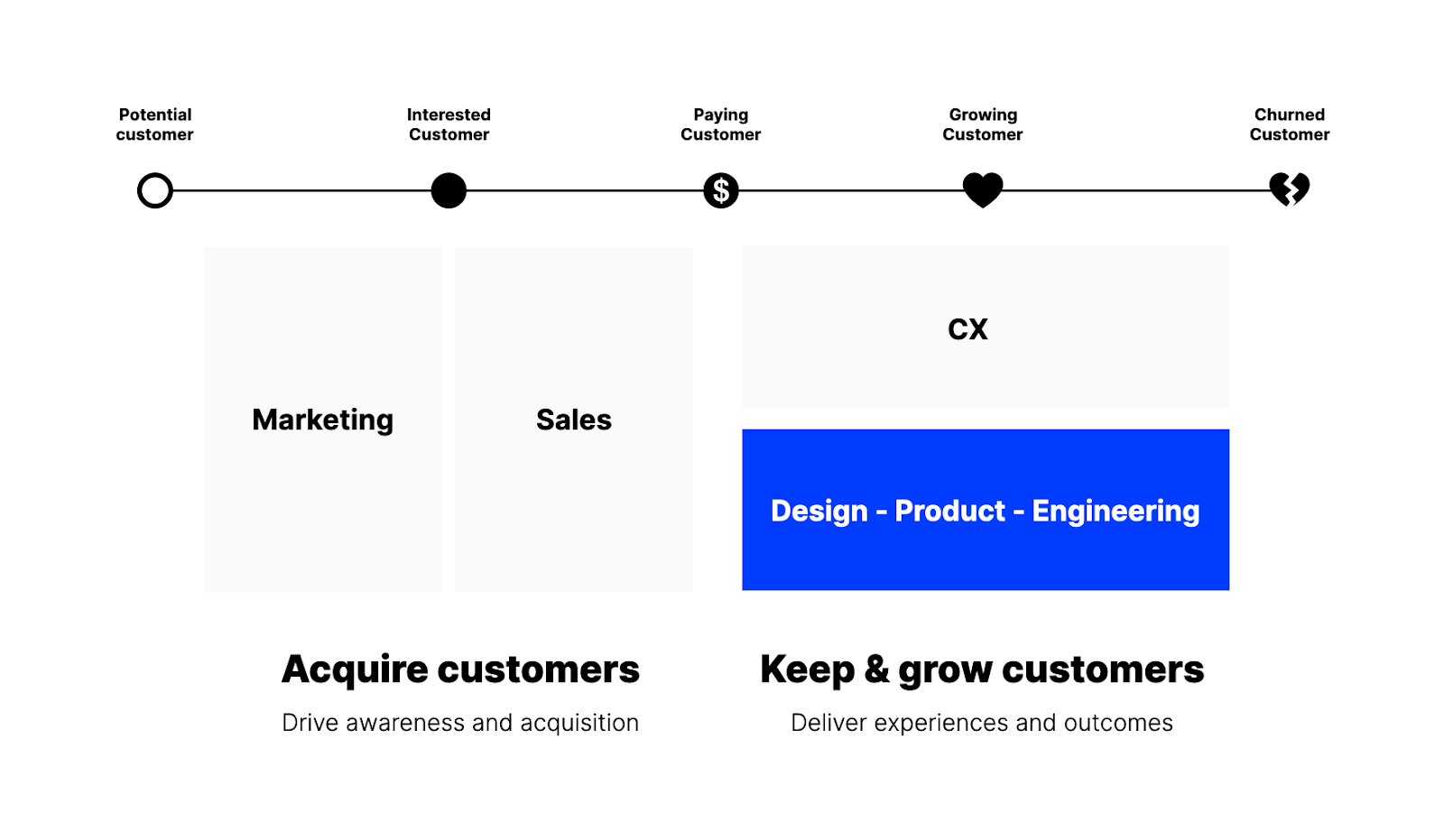
In terms of product and design, this affected the way we used to build onboarding experiences. We would rely on somebody from Falcon showing the product to customers who were never just dropped into it by themselves. Even after they bought the product, there was dedicated training, followed by regular check-ins with somebody from our Customer Success team. This means that onboarding was never the main priority for us, in design and the rest of R&D, and we spent most of our time building new features that our clients wanted.
This approach, while working perfectly for enterprise clients, is challenging for smaller ones – since it’s not scalable to handhold customers so much. To target smaller companies, we, just like our competitors, made a special entry-level product package that offers just the essential features. And we started offering free trials. Obviously, this gives an entire new challenge for our designers.
Product-led Growth
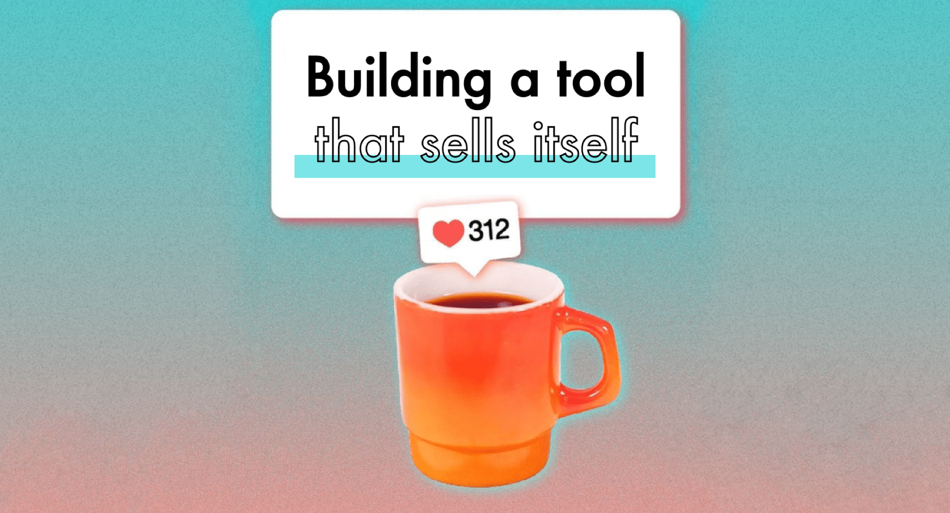
How does one design a product that sells itself? If you Google this question you will come across “Product-Led Growth” as a result. One of its pioneers, Wes Bush, defines it as follows: “Product-Led Growth is a go-to-market strategy that relies on using your product as the main vehicle to acquire, activate, and retain customers.” Notice that he doesn’t say “the only vehicle”, but instead, only the “main” one. The Product-Led Collective puts it very nicely; “it’s about harnessing the contributions of your whole company to build better, stickier products”. So, in the end, it’s really about building a good product, which is nothing new. What are some of the best practices or features that product-led companies tend to lean into?
• Free trial, as it lowers the barrier-to-entry.
• Minimizing friction by eliminating all unnecessary steps, as well as limiting the time spent before the customer sees the value of the product
• Continuously educating customers about how we can help them best and interpreting their usage data to understand their motivation and the triggers they respond to.
• Great user experience. The product has to be able to stand and shine on its own.
It’s a different focus that forces us to put product – and by extension, design – in the driver’s seat. Good examples of companies who have successfully set the focus on product-led growth are GitHub, Slack, Trello, Figma and Airtable.
Lean UX Canvas
Just like for any other product, the process of designing a free trial can be broken down into three simple parts:
• Understand your value
• Communicate the perceived value of your product
• Deliver on what you promise
We didn’t want to assume that we understand the value our product gives, so we decided to treat everything as an hypothesis to validate. We launched a free trial together with a new product package that includes a smaller set of features compared to the one targeted to enterprise customers. We also noticed that one of the main consequences of releasing the new package was the creation of a new customer segment. Implementing these changes was the result of us studying and trying to solve the problems our users encounter – not of us simply wanting to implement certain features.
We adopted Lean UX Canvas as a framework of how we build products. As its creator, Jeff Gothelf, puts it, the “Lean UX Canvas helps teams to frame their work as a business problem to solve, rather than a solution to implement”. This helps us make sure that we ask our customers less about the solutions and how they want something done, but rather we focus on the problems they have.

Lean UX Canvas consists of two parts; the first one (sections 1-2-3-4) is about getting to know the problem, the user, the benefits, and the metrics. The second part of the UX Canvas (sections 5-6-7-8) is about brainstorming solutions, formulating hypotheses and validating them in the easiest way possible.
For us it normally takes just a couple of hours to fill sections 1 through 6. The most time is consumed validating the hypothesis, which is done by asking two important questions: “What is the most important thing we need to learn first?” and “What’s the least amount of work needed to do so?”.

For the first question we evaluate all solutions by their risk and value, and then tackle the ones that rank highest on both criteria. For the second one we start with simply talking to our customers about a certain solution, then moving onto paper tests, interactive prototypes and so on. In the process we gather evidence for the viability of the solution and move up the “truth curve” into a “ready to be developed” zone. The important aspect of this Lean UX Canvas framework is that it helps us establish a very clear purpose and success criteria along the way, so that we know exactly what to measure in order for us to know if we solved the problem.
Onboarding Journey & First Impressions
On the organizational level, one of the first things we did was to establish a dedicated onboarding team. Before that, we used to handle onboarding in each team individually. But now, with the product taking center stage, we needed a much more coordinated approach to impress, convert and educate our users.
We formulated the business problem as, “How might we help the trial customers make a decision to buy Falcon during their free 14 days trial?” As success criteria we chose to focus on retention, while having a trial-to-paid conversion rate as our immediate goal – which we believe is a good start since it’s close to the revenue. It’s also measurable and it’s directly linked to onboarding. However, the true test of a user onboarding flow is not conversion; it’s retention – which means building meaningful relationships that last.
We learned a lot from our customer-facing colleagues from Sales to understand what makes users buy Falcon and which flows help trigger their decision to buy our product. We also talked with the Customer Success team to find out what behavior patterns trigger their decision to stay. On the customer side, we interviewed a group of customers and gradually constructed User Personas with their own “Jobs to be Done”; “Jobs to be Done” determine the customer’s specific goals and tasks, and the customer’s thought processes that lead them to use a product to complete the job.
By the time we got to the solution section of our canvas, we ended up with over 30 of them. We decided to split them by time, in terms of when they spring into action – pre-trial, first login, first 3 days, middle of the trial, last 3 days, or even after the free trial has ended. By prioritizing the start of the trial experiences first, we ensured that we put our best foot forward and avoided losing anybody early in the process. This meant that we started by asking ourselves what steps we could remove from the account setup phase. This way we could land people onto our platform as soon as possible. This was the reason why we, for example, ruled out a customer segmentation survey at the start of the trial. We liked the idea of a survey at first, but once we put it through the canvas and all the hypotheses it didn’t survive.

One thing we understood very early after talking to our Sales team is that the first impression definitely matters. Like any tool, Falcon shines most when you use it, and you can’t use Falcon much without connecting it to your social media accounts. That’s why we ended up strongly nudging people to connect at least a few of their accounts as the first thing they do when they join the platform, and with as few steps as possible. This way we could show them our tool in action right from the start. And this also made sure that during their first time experience, the user has something very recognisable and dear to them to see – their social content.
We decided that we wanted onboarding to be built into the product itself, instead of just being a layer on top of it, which is often a popular and easy way to go about it. Products like Userlane, Appcues and Stonly offer out-of-the-box solutions for product tours. We use this as well, since it’s easy and, in some cases, it’s a perfect way to educate. But we wanted to make sure that this approach doesn’t become our go-to way to fix all problems. Sometimes the onboarding flows are used as a quick fix for bad UX. We wanted to challenge the way our product was built and keep onboarding as the main focus point, instead of being an afterthought. This decision opened up all kinds of opportunities for us, and led us to completely redesigning the home screen of our app, to make sure it reflects the needs of our first time users and it helps drive feature adoption.
Aha! Moments and Metrics
Another thing that we picked up early about onboarding, educating, and consequently converting our customers, is the power of the “Aha!” moments – that is when the user discovers value in the product. We mapped them all out, or at least the ones we were aware of after all the interviews and research we conducted. The home screen I mentioned earlier was built to reflect and trigger a bunch of those Aha! moments. We even organized the whole performance tracking around those individuals’ Aha! moments. It’s especially helpful to put it next to the overall conversion funnel, so that we don’t just know how well we are doing, but also why we are succeeding and what behaviors should be reinforced or avoided.

Similarly, we decided to track the customers’ behavior separately, based on the outcome of their trial. After the trial, we split our users into two groups – the ones who converted and the ones who didn’t. That way we were able to measure what actions each group took and what Aha! moments they experienced. Doing this allows us to continuously validate all the hypotheses – “this works” and “this doesn’t work” – and to stay true to a problem-solving mindset, rather than one focused on pushing out features.
In conclusion
The problem we faced was reaching all the small customers without doing in-person one-to-one sales demos. We adopted a Product-Led growth approach, which led us to rephrase the problem; how could we implement a free trial so that customers buy the product without any human touchpoint? We’ve never offered free trials before, so everything around this was new to us; we needed to address a completely new customer segment and reinvent the product itself. We used the Lean UX Canvas framework in order to understand the problem, come up with solutions, and validate them. Ultimately this led us to building an onboarding experience around Aha! Moments.
We are at the beginning of this transformational journey and we still have a long way to go. Are you passionate about creating great first time user experiences? We are growing our onboarding team, if you want to join us, drop me a line andrius.knispelis@falcon.io.