
Kjegwan Leihitu defines himself as a digital designer and Avid Youtube comment reader. He is currently a lead designer and team lead at MediaMonks where he has been working for 13 years.
Kjegwan spoke about his involvement with Adidas at Design Matters 19. Today, he tells us about his nostalgia for the 90s, his enjoyment in being quirky, and the line between professionalism and being funny.
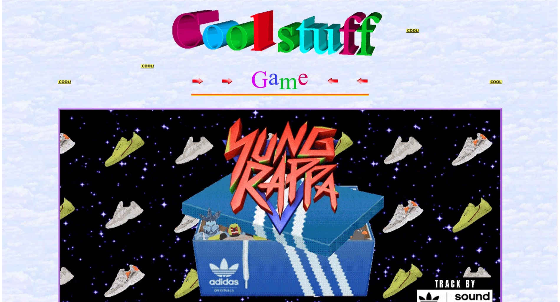
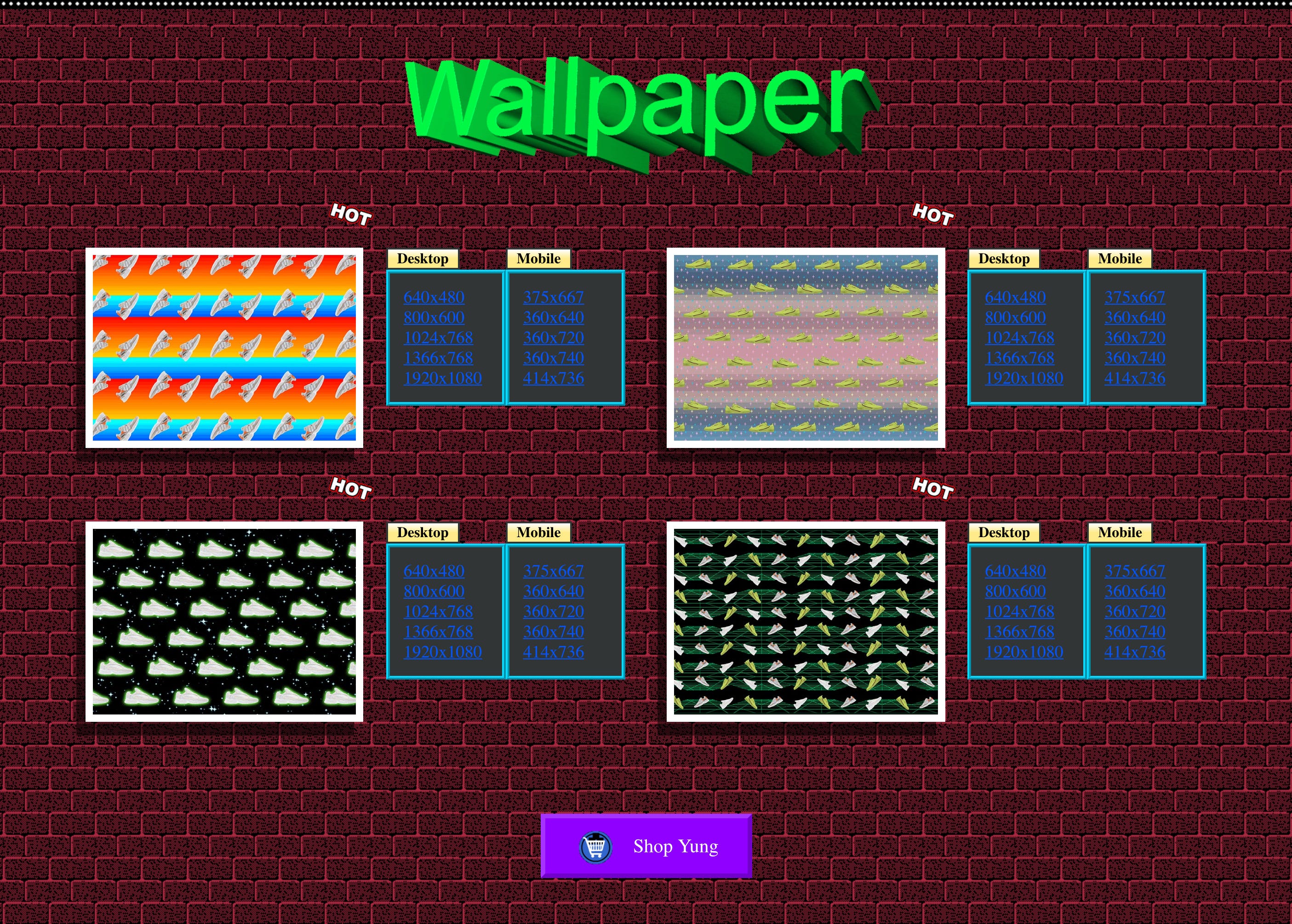
So, let’s talk about the Adidas Yung website you made. Were you intentional about making it FUN?
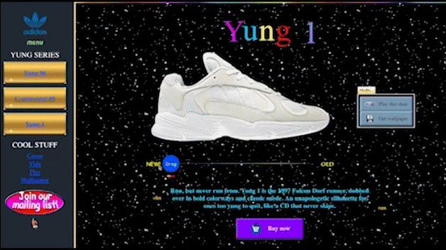
I was, but only partly, because the 90s were a different era where everything was more fun, or at least less serious. So to me it wasn’t about trying to make it fun, it was fun. We weren’t looking for making it fun — it was already there. We just wanted to make it look like the 90s. Plus, the whole team who worked on it were from the 90s, we wanted to bring back our childhood memories.
The website really has that nostalgic feel. Many of us remember the 90’s as a worry-free time, so much that some even call this period the ‘peaceful decade’. Don’t you think that many miss the 90’s because there is a different general feeling today?
Of course, when you’re a kid everything is different. At the same time, a lot of people refer to the 90’s as a time when everything was good. I’m pretty sure that there were political issues in that decade too, but the amount of things happening around technology, design, and animation was incredible, and people rather focused on that.
When you were creating the Adidas Yung website with your team, how did you go about it? How did you pick up all the elements?
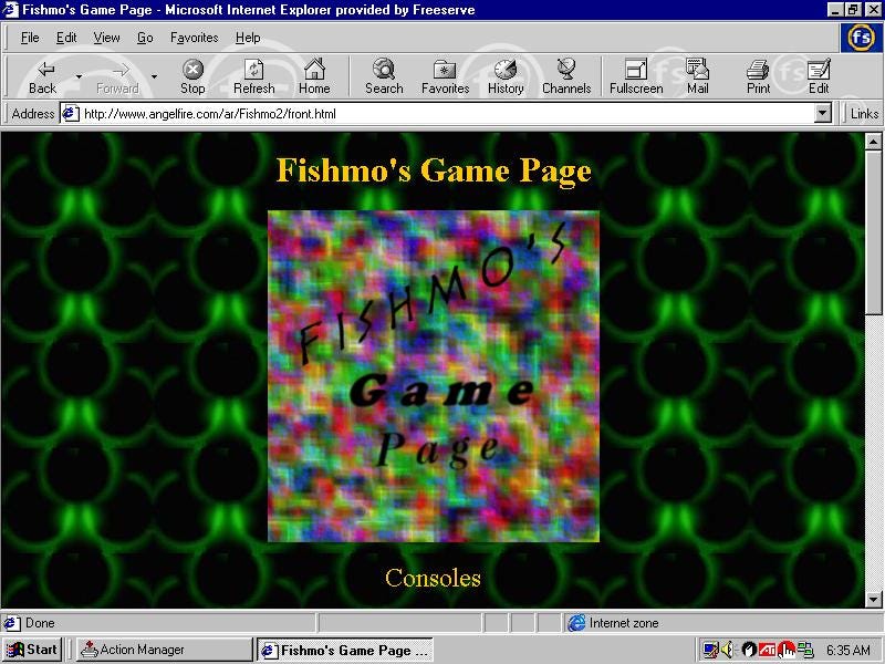
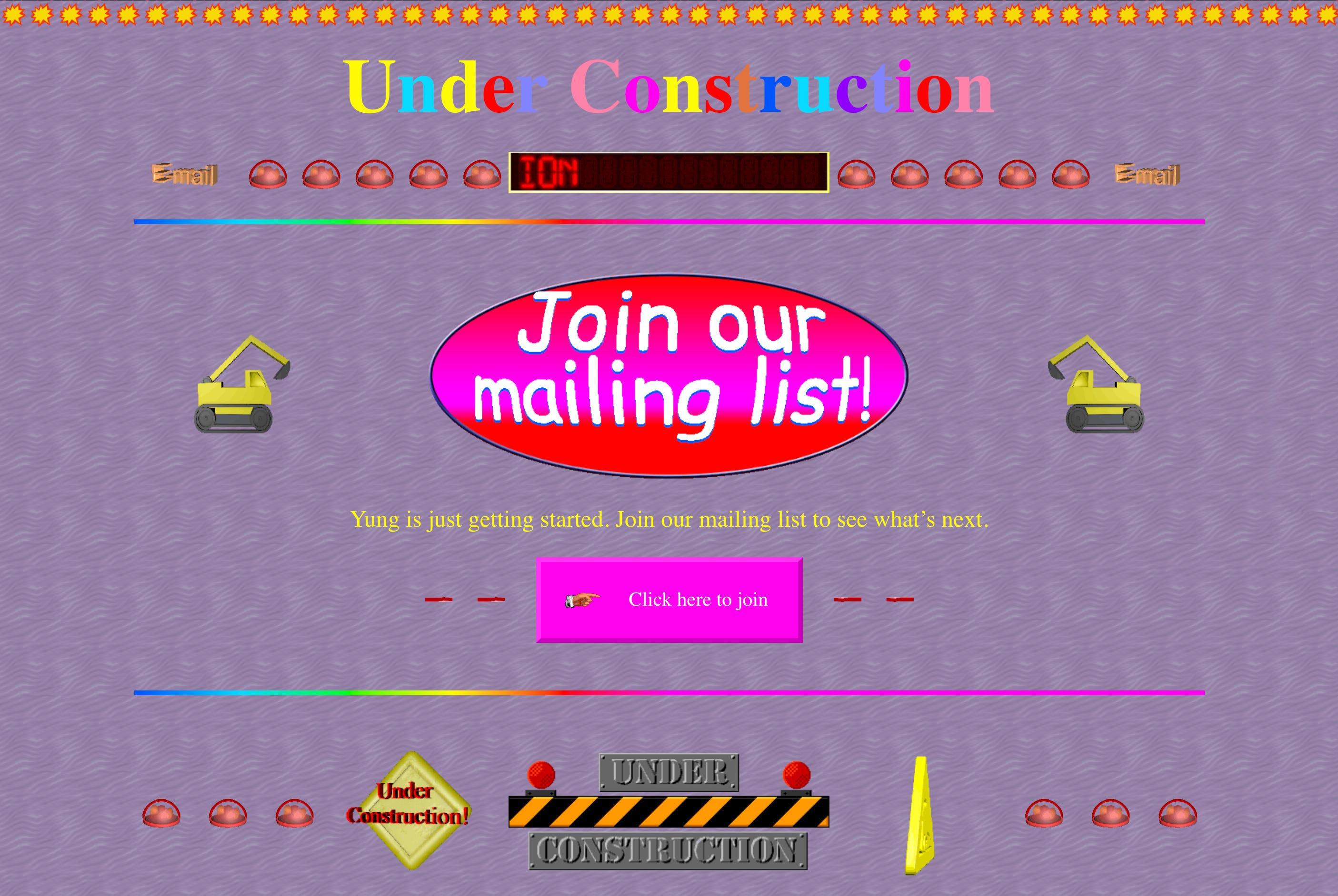
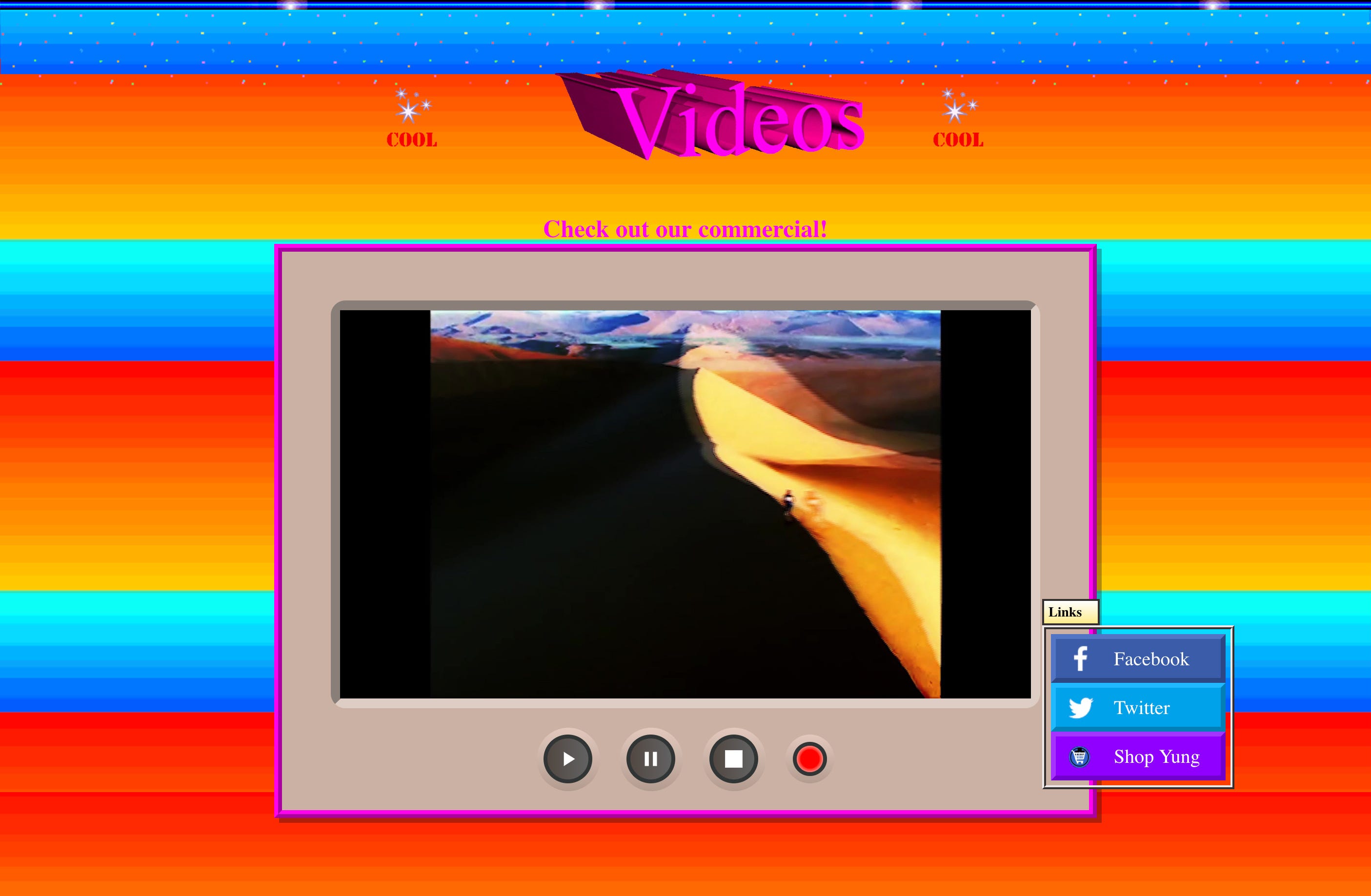
As you probably know, when you pitch something you do iterations of it and the client comes back to you with feedback. The fun thing in this project was that the pitch was almost the same as the end result. And the end result was basically a mix of research and stuff we had seen when we were growing up. We kept saying “remember this, remember that?”. Remember the USGS or Angelfire website? My colleagues and I saw it again and were reminded of how horrible it is, but we told ourselves, “we just have to do it!” Remember the broken visitor counter? We put it in there too! The guest book, and all these elements really felt like a time machine. Every element on the website was a sort of reminder of what the Internet used to look like. That was the extra fun we had — it’s so ugly, but it works, and it’s also so fun to work on.
When you presented your website to the public — you talked about this at Design Matters 19 — some people didn’t like it or thought it was a joke, right?
That was the fun part! A lot of people at Design Matters 19 came up to me with a smile on their face saying “I lived through that! Thank you for bringing me back to this wonderful era.” But there are also people, especially on the Internet, saying, “I don’t get it”. They’re used to seeing sleek stuff. But they don’t get that the purpose of the project was to bring you back to the 90’s. These people only look at the aesthetics, how sleek an animation is or how a website works, but they don’t get the concept behind it.
Perhaps some people are too young and didn’t experience the 90’s, or perhaps they just hated the 90’s. If you haven’t lived through the 90s, you don’t really get what you’re looking at. When I talk to older people, many say that they remember, but that the aesthetics were ugly. Although, they say that with a smile on their face.
Perhaps in 20 or 30 years time somebody else will do the same; they will replicate today’s design, and it will cause the same controversy. When you were in the processes of iterating and creating the final product, was it hard to convince the client about the direction you wanted to go in?
They loved it from the beginning! That’s why the pitch phase didn’t really change. I think our client, Adidas, understood what was happening. The “harshest” feedback I got was that they asked me not to do yellow text on a white background. They recognised it was a 90s thing, but they said that we still have to be able to read it. Fair enough, I could live with that!
If you had the chance to do another crazy project with complete creative freedom and an unlimited budget, what would you like to do?
Hard question! I think I would do a lot of research on different technologies and how to implement them… it’s almost futuristic thinking. Investing in a technology and exploring how it would look in 20 years — I would like to approach that. If I had an unlimited budget, researching how you can evolve humanity in design or web design would be interesting. It would be something out of the box, that doesn’t have to exist yet. If I were to contact an agency that is specialised in innovative thinking, then there would be a lot of room for investigating these kinds of things.
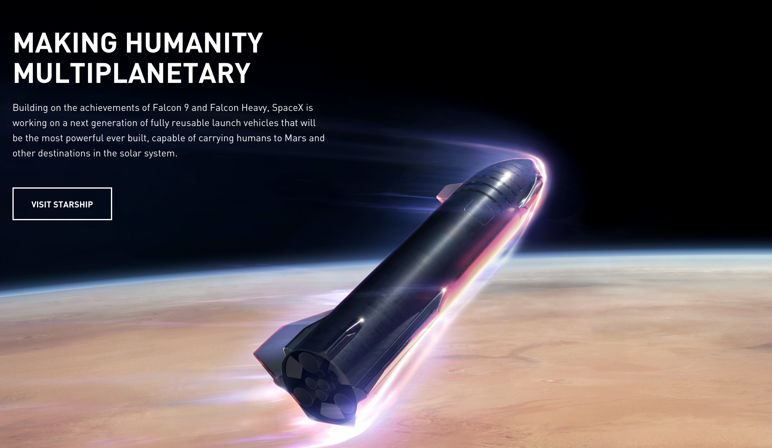
One thing that comes to mind, which is quite futuristic, is space exploration for private use. For example, Elon Musk’s SpaceX aims at making space transportation more affordable to enable the colonization of Mars. However, these crazy experimental projects require consistent financial resources, which not everyone has.
One of our clients asked, “how do you see this company helping us in the future?” and asked us to come up with ideas. The technology didn’t even have to exist, it was almost like being in a Black Mirror episode, even though Black Mirror takes a negative turn most of the times. I think there are several positive sides to these futuristic projects. We have a chance to do good for humanity, and Covid-19 is a challenging example. How can we make everything better while living with other people? How can we make things simpler and better? I think these are questions whose solutions would indeed cost a lot of money, but if there were the budget, there would be so much one could do.
Do you think designers have come up with interesting and creative ideas during this pandemic?
No, not yet. But there are many opportunities, especially now, since people have enough time. If you don’t have enough time now, I don’t know what’s wrong with you. Maybe I’m not paying enough attention to it or I’m not looking in the right direction, but I haven’t seen any crazy ideas yet.
However, sometimes you simply stumble upon things. I saw a video on YouTube showing colorblind people seeing colors for the first time thanks to some newly invented glasses. I get so emotional when I see these videos. I read somewhere that the person who invented these glasses did it by accident. He was creating glasses for some other purpose but found out that they can actually help color blind people see. So he stumbled across something that was very helpful for something he hadn’t planned. This shows that sometimes you invest in or create something which wasn’t exactly what you wanted but still has a purpose.

For example, there is an artist, called Neil Harbisson, who was born color blind. At the age of 21, he had a bizarre looking device that looks like an antenna attached to his head that translates colour into sound — he can now hear colors.
Do you think there is a limit to when design should be funny?
Humor is also a way to stand out and be remembered. If you are approaching an app with a little bit of humour, people will remember it. It will make them smile or giggle if you use a funny text or image, and it will stick to their minds. Depending on who your audience is, you should tailor your tone of voice to that audience. Sometimes you want to make something funny because you want clients or, in general people, to remember it. This is important for portfolios too. Thinking in unconventional ways is, for example, not looking on Dribbble because you don’t want to be exactly the same as everyone else.
Making people laugh and using humour can surely help when you apply for a job too. Once a colleague who was applying for an internship asked me “what do you think I should send to the boss?” And I said, “Make it a little bit more personal. But above all, make it fun. Someone is going to read the same cover letters everyday.” So he wrote that he’s a ‘pop-locking dancer, breakdancer/designer’. This funny story was one of the first things my boss picked up on. He said “this guy has a lot of potential. He’s funny.” Humour gives you more chances to stand out.
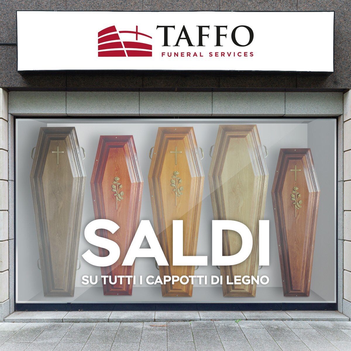
There is an Italian funeral service company called Taffo that has become famous for its ironic, and sometimes cynical but never offensive, slogans about death. The agency KIRweb that build Taffo‘s brand did exactly this: they brought humor into something generally considered a taboo.
This is funny! I feel that a little bit of humour can do wonders, it breaks tension. I’m thinking of when we do presentations for clients. Sometimes we are asked in advance not to be too funny. But most client presentations are rather informal, they’re more of a conversation than a presentation. We use a lot of GIFs. A meme or a GIF could say so much more than words — these things really help sell!
Do you think there is a golden trick to make a design memorable — not necessarily only being funny?
People will remember why something was funny. It can be an interaction, a GIF, a cool design element. If someone recognises what you did because it was funny, I think you’ve done a good job. You must have done something different, because there are billions of other things out there on the Internet.
I noticed that people’s tone of voice makes a difference. For example, in a portfolio it’s boring to read “hi my name is X and I’m a digital designer.” If you can create a funny line, it shows character. Your tone of voice will set you apart from others.

In your case, your website is amazing. I can feel you’re not afraid of being yourself. It’s also about confidence!
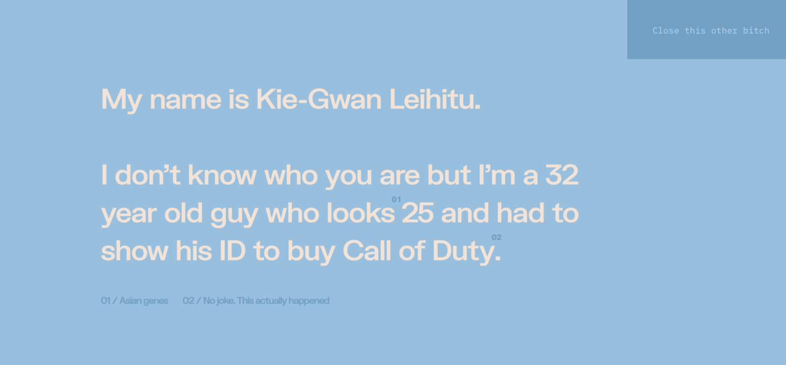
If you’re not comfortable in your own skin, you’re just going to stick to what’s in your comfort zone. For myself, I have a GIF on my portfolio with middle fingers and a voice over and stupid CTAs. All my colleagues would say “yeah this is you — you do stupid puns and jokes”. But it’s exactly what your website is: it’s your online presence. Also, a little bit of humour never killed anyone.
Have you ever failed at using humor thinking a joke or a GIF would work but turned out to be a complete disaster?
Always! All the time! Every time I think something is funny, I let it sink in for a few days and then I end up thinking it’s not that cool. Sometimes what you think is funny is not funny to someone else. You need to have a balance in that. I have failed a lot, but also to be totally honest I enjoy laughing at my own jokes. I’m having fun! This also applies when I’m building my own stuff, and you don’t necessarily have to like it. If you do, it’s an extra for me. I have to like it. Hopefully your audience will be similar to you and like what you do.
It reminds me of what Ricky Gervais said in a stand up once; if you are walking down the street and see a big sign advertising guitar lessons, you don’t call up and yell “I don’t want guitar lessons!”, you just walk away. Whereas today, many people feel the urge to write their opinion on social media, instead of just closing the page or unfollowing you.
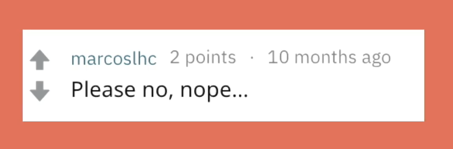
Many feel the need to offer their feedback online, but not as many are willing to do so in real life. You said you experienced this on Twitter too— people commenting negatively on your design. How did you react?
I find all this entertaining because I can see the older you get the fewer fucks you give about things. If someone says “that person has ugly shoes”, if that person likes those shoes, I don’t care. If someone doesn’t like my design or my portfolio, I don’t care. I like it. It might sound selfish but I’m not creating something for someone else. It’s for me. It goes the same way for social media. I went to see a talk once and they said, “if you’re doing it for the likes, you’re doing it for the wrong reasons”. That resonated well with me, why should I serve other people? I don’t care what you think of my stuff. I like it. That’s the joy I get from these things. People commenting negatively on Social Media has been happening for a long time, but why make it so hard? Why be so negative? I’m not saying I’m never negative, I just don’t have the urge to go online and voice that I don’t like something. If you don’t like it then don’t look at it!