
Vitaly Friedman is the co-founder and creative lead of Smashing Magazine. He loves solving complex UX, front-end and performance problems. For years, he has been writing and curating content about design and web practices, making him one of the most knowledgeable designers in the field. He also speaks at conferences, and runs front-end/UX workshops and webinars.
Why are many UX patterns and practices still being used, despite they can be so ugly and user-unfriendly? We reflected on this matter with Vitaly, discussing how designers can craft better interfaces. We also looked at 2020 design trends, suggesting what designers can do to stand out in a competitive environment dominated by tech giants. This led us to addressing how user privacy and data are treated in design, a matter that has become more relevant than ever in a time where a pandemic, and numerous political and social events are affecting the world.
Vitaly will speak at Design Matters 20 as well as host the exclusive workshop Smart Interface Design Patterns, where he will discuss more in depth the topics that we are touching in this interview and much more.
In your workshop, Smart Interface Design Patterns, you break down and examine hundreds of design patterns. What pushed you to gather so many examples?
I absolutely love sharing what I’ve learned, and learning what others have experienced. In fact, one of the major motivations for the workshop was my curiosity to find all the little fine details that make an experience stand out, while also finding all the fine details that break the experience altogether. So gathering them all in one place was an ongoing journey for me for almost a decade now. I would love to see more accessible, usable and fast web experiences around us, and so every time I notice some issues showing up in usability tests, I try to find a way to make things better. That’s an exciting design challenge for me personally, but also a never-ending journey to find how designers around the world solve the same problems in different ways.
The workshop is also my personal library. Some people keep books as a point of reference in their homes, and for me, the workshop is actually a way to collect and organize all the examples and findings I discover in my work. At this point, it’s become a very comprehensive library of more than 3000 slides and videos about pretty much anything — from accordions and footnotes to date pickers and configurators.
What are the most common, yet disruptive, UX choices that we see on mobiles and desktops today?
I think that some common issues appear when we, designers, rely too much on things that became “standards” in the past. We often rely on generic choices without questioning them. If we think about navigation, hamburger icons immediately come to mind. If we think about search on mobile, we think of hiding it behind a search icon on the top of the page. It’s remarkable to see tests proving that our assumptions are too often wrong.
Whenever we make things more obvious, suddenly people are using them more. So, for example, if you want to encourage people to search more on your site, you have to make the search bar more prominent — larger, bolder, wider, and visible.
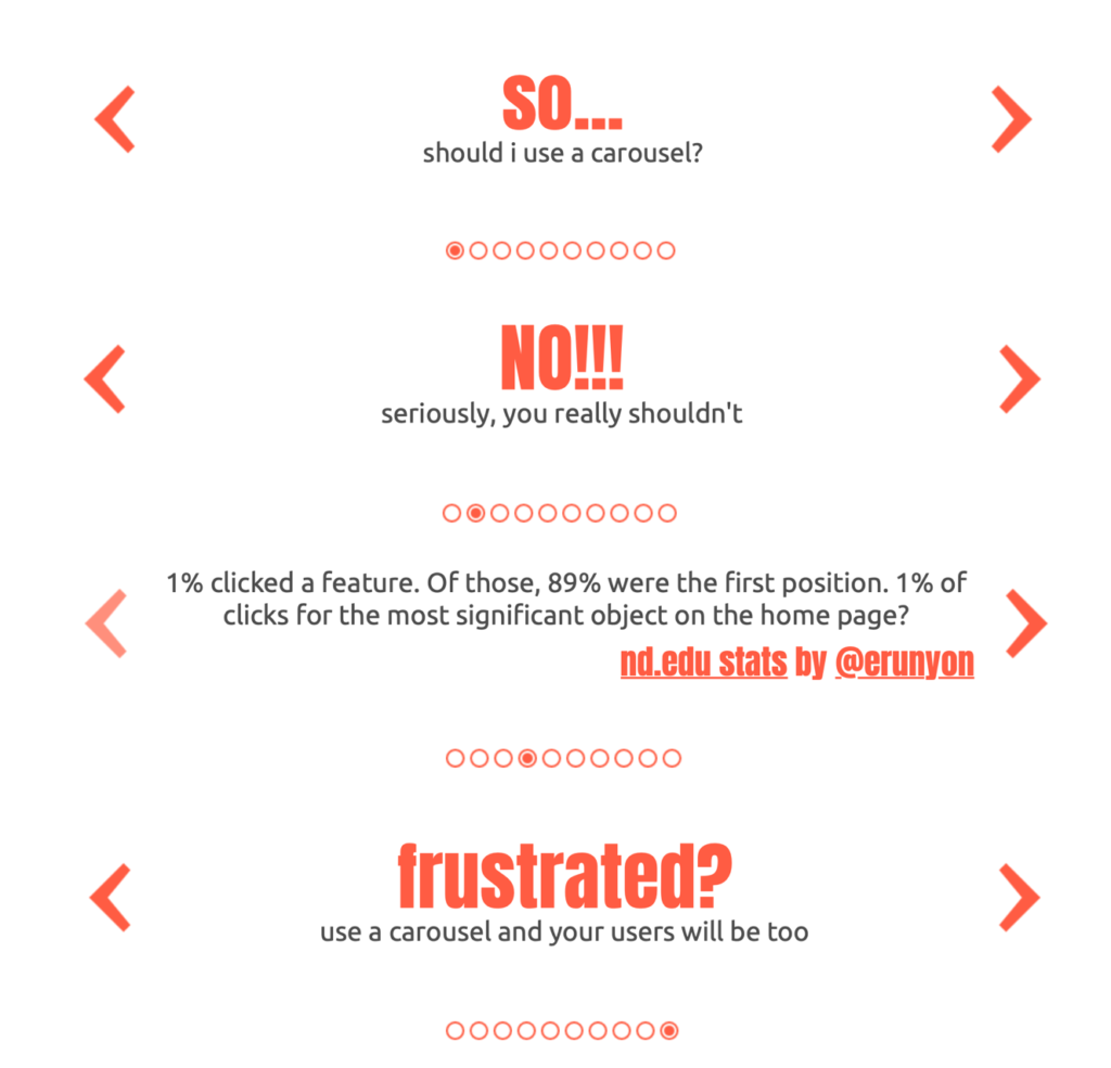
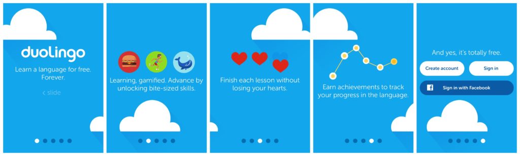
Another common issue is about the use of carousels, and sometimes tabs. There is nothing wrong with both components per se, and they are a good option for a more compact way of presenting information, but if designed poorly, they aren’t helpful at all. Carousels can work really well in particular scenarios, such as product pages, for examples, but usually not on home pages. Whenever we use tabs on product pages, the information is scattered across the tabs and can be missed, unless tabs stick on the top of the page. When we look at onboarding in apps — like cards to swipe through — the “skip” link is usually the most popular feature, which has an incredible heatmap. It’s not uncommon to see that at times the engagement increases if the onboarding is removed altogether, and experiment with in-time-education or empty screens.
Why do you think there is still so much resistance in changing interface design patterns?
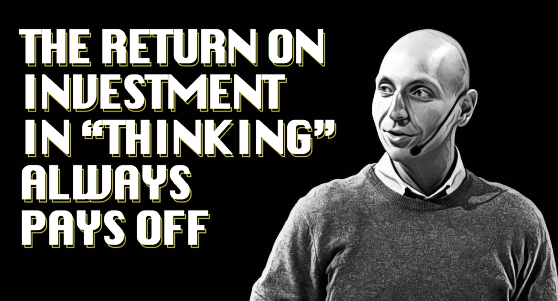
Many people love reliable patterns that just work in every project — not because they are lazy or don’t like innovation; it’s just infinitely more difficult to come up with a new brilliant idea every time. And very often it’s absolutely unnecessary. On top of this, many designers are often running behind schedule, and don’t have the time to find an approach that works best. So, they rely on existing libraries and off-the-shelf solutions, which aren’t necessarily the most accessible and usable ones. It’s always a good idea to challenge every single design decision we make. There must be a good reason for using a hamburger icon, or placing a filter icon in the right upper corner, or showing push notifications prompts on the page load. And, frankly, that reason is often motivated by short-term wins that dismiss the long-term consequences of these actions. Short-term decisions are costly and damaging, but very often business requirements or tough deadlines prevail. I always ask companies for some buffer to fail, experiment and think about what we are designing and building. The return on investment in “thinking” is often worth it.
Are there any good apps or websites that, in your opinion, are designed really well or that have great specific features?
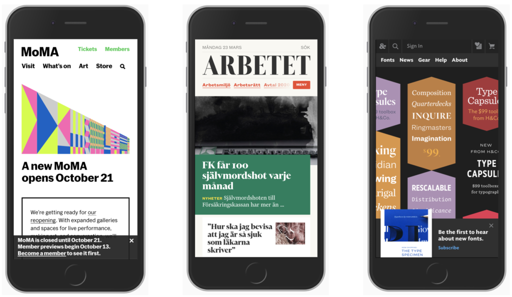
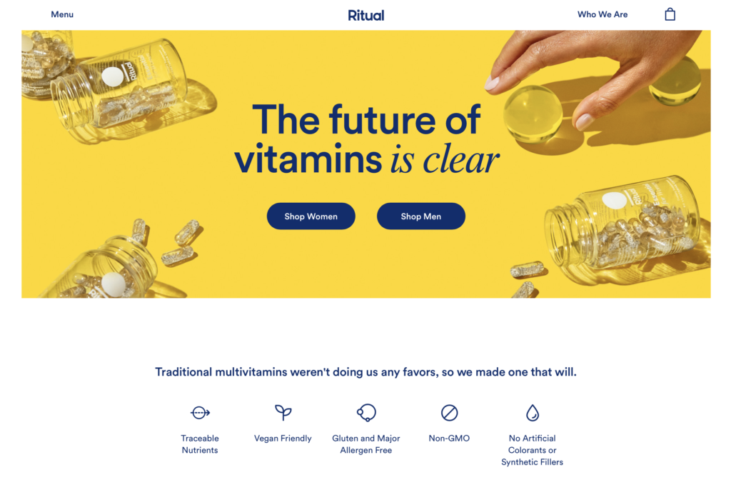
There are many! One is ritual.com. It’s nothing groundbreaking, but I feel that it’s designed really elegantly. The New England Journal of Medicine has beautiful footnotes. Stripe.com offers a very gentle and smooth experience and has a nice use of animations. Together with Mailchimp, it is interesting from a design perspective. We see so many companies driven by features and technology, but some companies have understood that if they want to succeed and stand out, they need to think more about design. Only through design they can truly connect emotionally with the customer. Features allow them to do that too, but they are way more expensive and not as effective.
So, what should one do to stand out?
You need to care about details. These days, I don’t spend time in Sketch or Photoshop, or any image editing tool. Instead, I spend most of my time in a spreadsheet or in a text editor, thinking about the proper labelling and microcopy, and the position of elements, rather than the shapes of icons or color of buttons. My goal is to minimize misunderstandings and confusion when interacting with an interface. This has been particularly relevant in a project with the European Parliament, where supporting different languages, accessibility and absolute clarity were key.
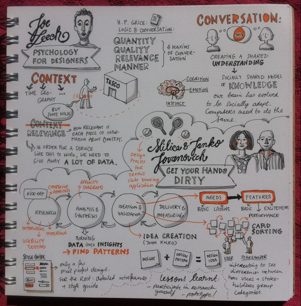
Joe Leech, an excellent UX designer from Bristol, UK, once said that his job as a UX practitioner is to take the right things, give them the right names and arrange them in the right order while delivering right answers to the right questions that customers are likely to ask.
I don’t think flashy animations are required today to stand out — we can stand out by providing absolute clarity about our product while being calm, kind, generous, respectful, authentic and honest with our customers. At least that’s what I’ve been trying to do all these years.
Speaking of design trends. What is hot in 2020?
I’m not a big fan of trends, but I love observing what helps designers and developers get attention and reputation. And often, many sites that are considered great are the ones that get their priorities right: accessibility, usability, clarity, and speed.
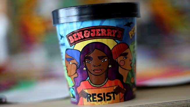
Also, companies are now crafting more authentic experiences, stating their principles and what they stand for. They make political statements and don’t shy away from expressing their values publicly, giving their brand more personality. People are now very conscious about what happens in the world, and many brands are supporting particular causes too. Today, you need to have an opinion and take a position, both as a company and as a consumer, to be taken seriously. Design today has to answer some ethical, cultural, and political questions on what’s happening in the world, and has to be respectful in that regard.
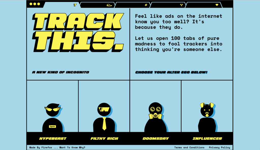
But there are also all kinds of cookie pop-ups, push notifications, and newsletter boxes “screaming at you”, which people are learning to fight against. It was interesting for me to observe, over the course of the last year, how people have become more familiar with ad-blockers and privacy tooling, especially in light of GDPR and privacy legislation coming to the US. Everybody seems to be more aware and, as a result, more careful, and companies are realizing this too.
As designers, when we build products, we should find the right time and space to ask privacy-sensitive questions respectfully. We should ask ourselves, “what is the right time and place in the user journey to ask to receive push notifications?” Most of the time, the right answer is only when we’re absolutely certain that we will get a resounding yes. If we are uncertain or are unlikely to get a yes, then we probably shouldn’t show it.
You are concerned about Privacy and Data usage. If education on Big Data and Cookie Policies were compulsory, what would you consider fundamental for everyone to learn?
This is a good question. I think we should first ask ourselves “what exactly happens to our data in the first place?”. Most of the time, we just don’t know what data is collected and how it’s used. I don’t feel comfortable knowing that my data is used to create profiles that would then be targeted by political parties or insurance companies, for example. But many people don’t really see the impact of the data being collected, and assume that it’s never used in a wrong way. Many companies collect, use and sell data to help third parties manipulate us into buying, voting, or taking some sort of action — and we follow along, not even noticing that we are being manipulated. This shows up frequently when we get targeted by Facebook or Instagram ads. As a result, we are bombarded with one version of reality which isn’t neither representative, nor balanced at all. We get trapped in a bubble without even realizing it — and this bubble shapes the way we think and make decisions about our life. Up until lately, this wasn’t regulated at all. We first need to get some sense of awareness about what happens to our data.
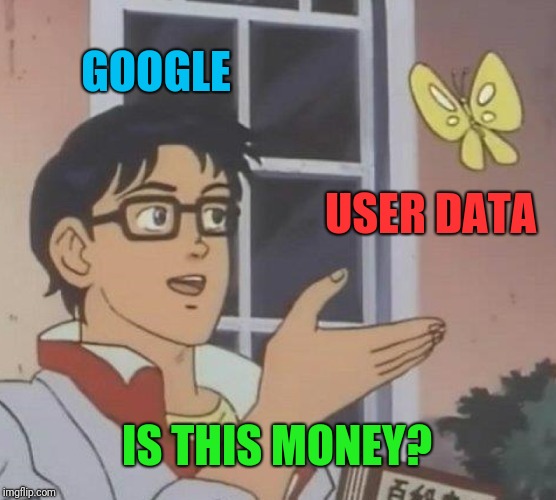
Instagram, Facebook, and many other websites collect some of our data to sell it and, in exchange, give us access to wonderful and useful services. Often we don’t really understand that we’re paying a price for these services. There is a good reason why many of those companies don’t even think about setting up premium accounts; our data is much more valuable than a few dollars a month we might be willing to pay to access these services. I’m not saying that we should chase and ban all the services! We simply need to be conscious about this transaction and understand what we are trading, and then make a conscious decision to proceed or not.
We should also think about how to integrate respectful, privacy-aware decisions into our design and development process. How do we make a case for privacy in situations where business is driving certain “grey area” decisions? What metrics do we use to make a convincing argument against it? Can we rely on some case studies to show the consequences of decisions, and argue short-term vs. long-term? We need to understand how we can embed privacy to help businesses succeed and thrive, become viable and prosperous, whilst still being respectful of users. We’re not there yet.
Do you think it will take long for companies to become more respectful of users?
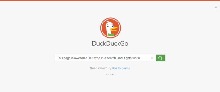
Some companies are trying to make a change.DuckDuckGo for example, is very aware of privacy matters. They are pioneers in this field and so far ahead of time compared to everybody else. But there is no way they’re gonna compete with giants like Google or Bing, despite they’re making a better product with a beautiful design in terms of usability and accessibility. A new company can’t compete with such giants.
We need to provide alternatives, and seeing DuckDuckGo is important. However, change should also be pushed from within the team designing the product. Every product reflects the values of the people who designed it. So, if companies want to design in a more privacy aware and respectful way, designers and developers have to bring up some uncomfortable questions and talk about controlling how much data can be shared. Luckily, the legislation is helping us there. It’s great to see large companies pushing for providing customers simple tools to restrict the use and collection of data. We should be able to make a conscious decision, instead of taking companies imposing their decision as a default. This is why I think GDPR is important; it gives us control. We can now say “yes” or “no”, whereas in the past when we couldn’t even make a choice.
Perhaps in the future a supranational policy on data treatment will be created.
Privacy-related global policies are very hard to make, as different companies have very different interests and have a major impact on our lives. But I’m trying to be optimistic. I think we will see change, because, in the end, we are shaping change with our actions.
I think we can always make something good out of something bad. Take this year as an example, and think about what we’ve been learning and experiencing. This is a year of reset and reflection where many designers are asking themselves what kind of digital products we really need and want to design. It was interesting to follow the discussion about designing Corona-tracking apps around Europe and the world, because so many critical issues arose; privacy had to be included in design. And it had to be done very fast, in a scalable way.
I’m hopeful that this year will help us recalibrate priorities and discover ways to push important things first. And I can’t way to see this change happening — all over the world. And who knows, maybe we’ll see a big change in carousels on Turkish websites, or less tracking on American sites. I’ll be watching!