
Michelle is a Design Advocate at zeroheight, where she serves the design community through knowledge sharing, building bridges, and identifying community needs. She leads the DEI Committee at zeroheight and career coaches underrepresented communities in tech. Her career has included roles from Principal Product Designer to Design Manager to Principal DesignOps Manager. She also co-hosts the UX In Real Life podcast, which examines UX at work and in the world around us. Additionally, Michelle is an environmental justice advocate, works to provide tree equity in Oakland, California, and enjoys scuba diving.
As a designer, I always seek new inspiration to help me design better. Sometimes, I reference things similar to what I’m working on. But most of the time, I’m looking for inspiration in totally different areas because that helps me push the boundaries of my work. When I worked on a file-sharing app, it was easy to reference competitors’ features, but it didn’t lead to innovation. It led to creating parity. Instead, I would seek inspiration from streaming service apps. While distantly similar, they opened my eyes to how I might surface or list information.
My latest source of inspiration completely caught me off guard. I’m still having trouble figuring out what it means and how it applies to my work. But it made me realize that exposing ourselves to new cultures is vital to being an adept and inclusive designer.
This year, the Design Matters Tokyo conference invited my colleague and me to host a workshop. I was so excited to visit Tokyo! Almost 20 years ago, my last visit was a huge source of inspiration. Visiting this time would be different. Things in Tokyo would have changed (after all, my last visit was before smartphones), and I had grown so much personally and professionally. Instead of looking at things as a fledging graphic designer, I’d be experiencing things as a seasoned user-centered designer.
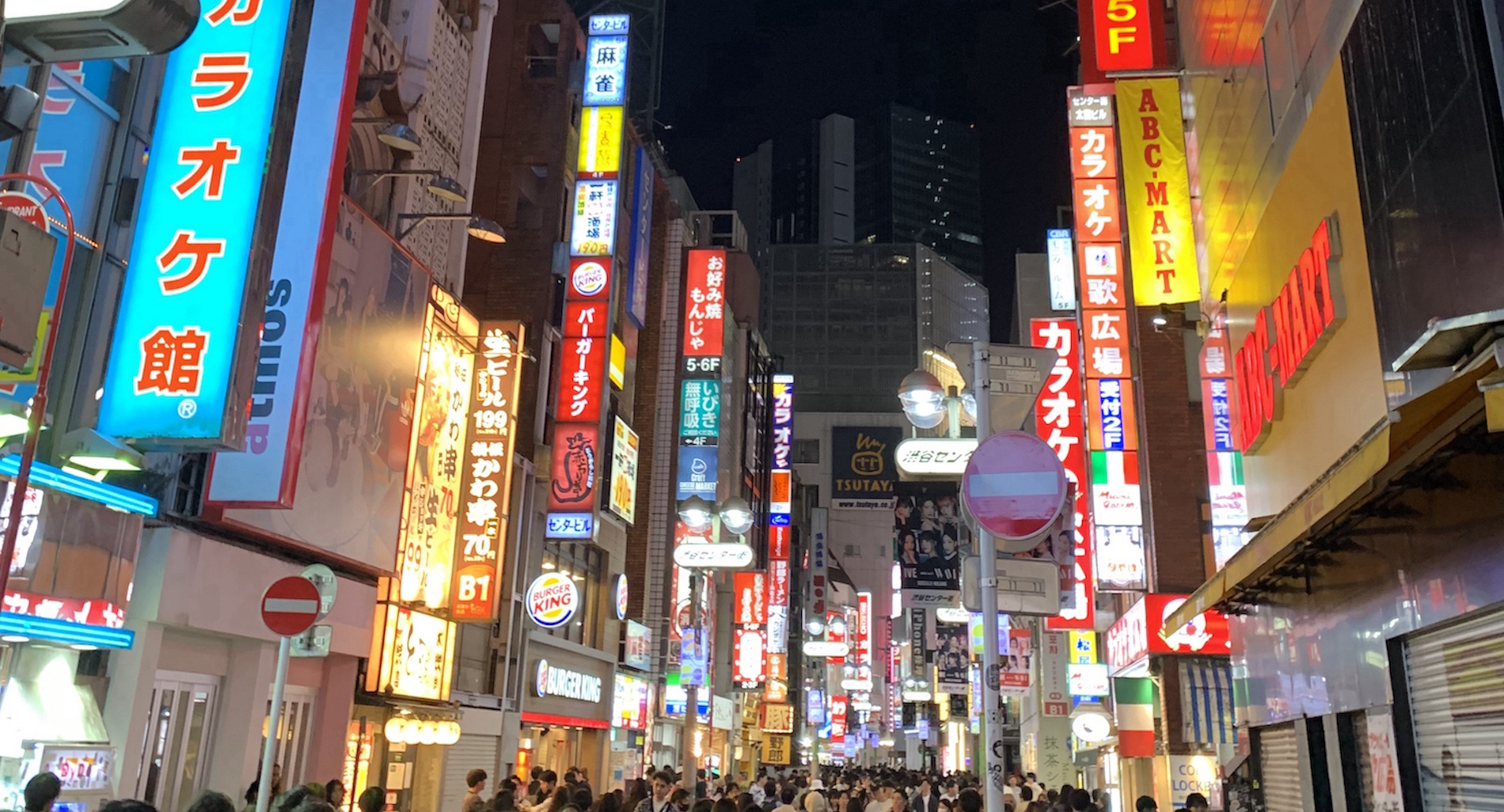
When most Westerners think of Japanese design, minimalism comes to mind. But things are noticeably different from that almost immediately after you get off the plane. While airports typically have a lot of signs, there are many more signs with a lot of information in Japan. Even the toilets had way more options than a Western-based toilet. (In the US, you typically only have one option and two options at eco-friendly places.) It starkly contrasted the minimalist aesthetic we picture Japan as having.
From a UX perspective, I found this fascinating. It made me question, “Why is there so much information presented? What might we be missing from the design culture I’m used to?” At the conference, Ryo Sampei presented “Where’s the Wasabi? Finding Design Potential in your Indigenous Roots.” He mentioned something that resonated with me: UI design is mostly Western-based. I never considered this because I never had to. I naively assumed user experience is designed for everyone, and guidelines like the Apple Human Interface Guidelines (HIG) and Material Design are made for everyone. While it intends to serve a broad user base, it comes from Western ideals. It just goes to show how systemic the white male patriarchy is.
But from 1603 to 1868, Japan upheld “sakoku,” an isolationist policy severely limiting trade and relations between other countries. The policy was a solution to remove the colonial and religious influence from European countries. Sakoku shaped Japanese culture, and its effects persist today. It’s why Japan’s culture feels so different from most of what Westerners experience and what makes it challenging to explain.
I struggled to articulate what I noticed about Japanese culture – how it’s full of contrasting opposites and not in a negative way. Ryo summed it up quite nicely when he mentioned: “co-exist.” He pointed out how Japanese people love minimalism (e.g., Muji stores) and maximalism (e.g., Don Quijote discount stores). These polarized opposites co-exist in Japan together without any friction.
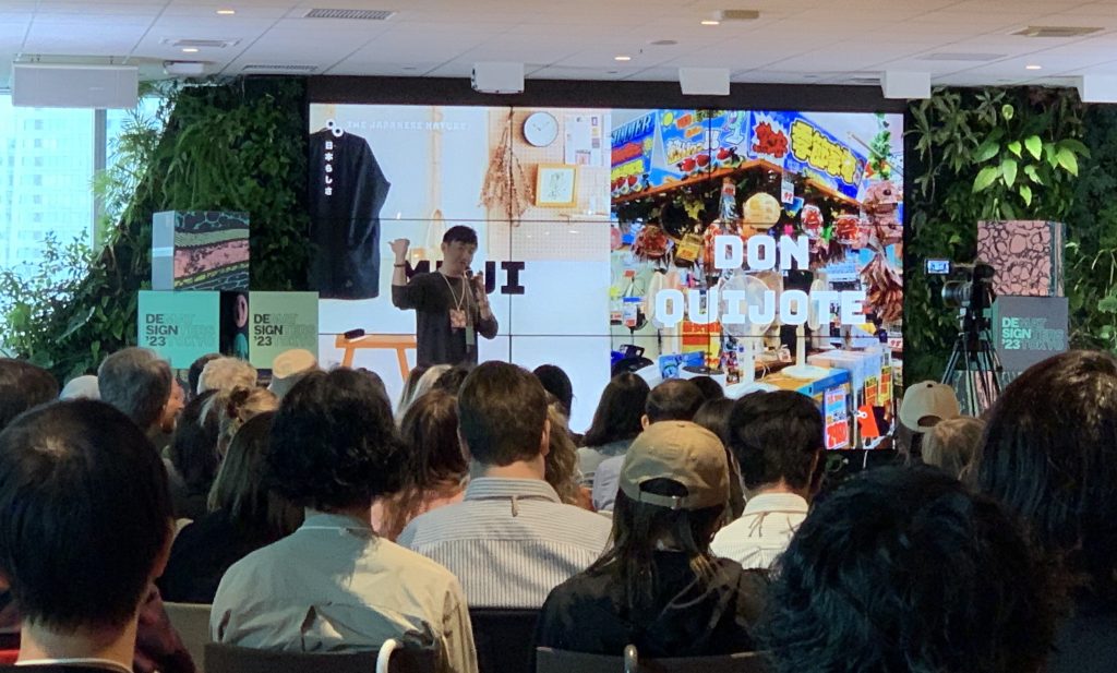
Photo by Michelle Chin.
Usually, in the U.S., it’s one extreme or another, but both don’t co-exist in the same space. Or things are very “middle of the road,” where things aren’t in either extreme. So this made me question, “Are we missing something in Western design culture?”
And the co-existing extremes aren’t only in the shopping tastes. I came across several other examples in my short time visiting Japan.
Natural settings and mega-city environments
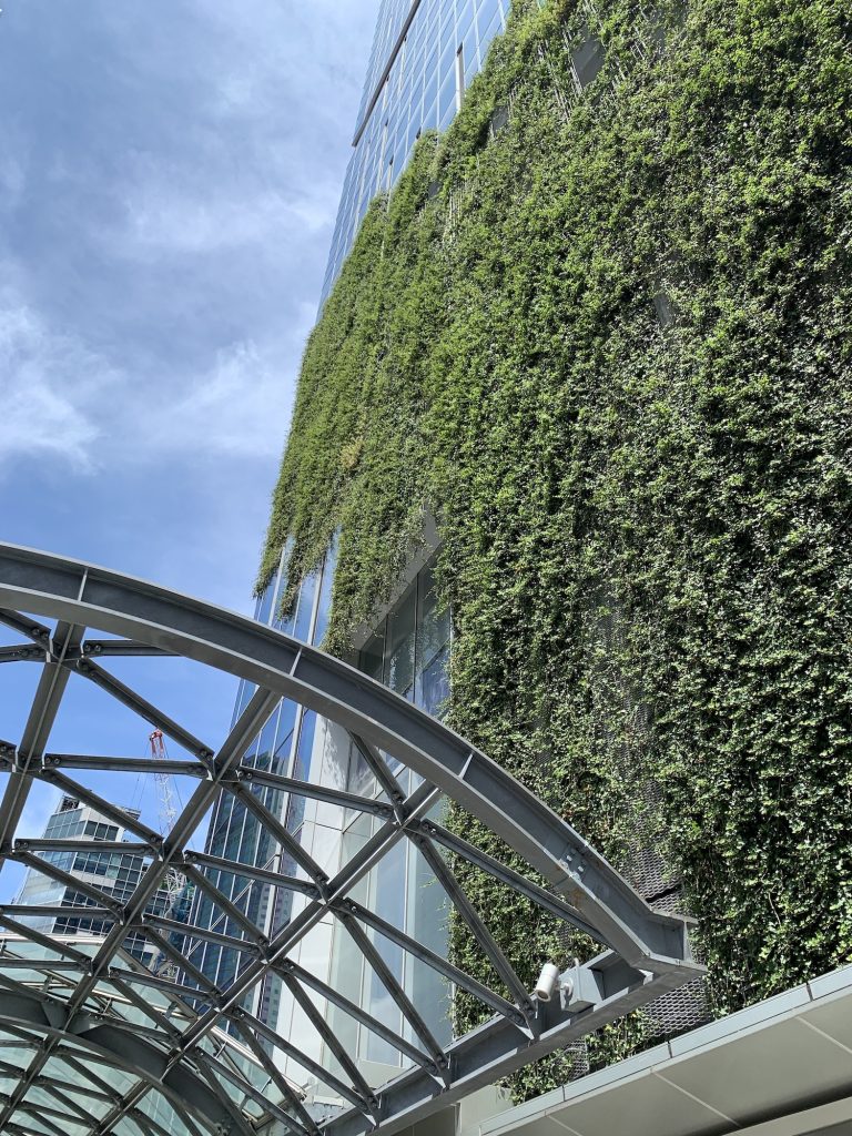
Tokyo is a busy metropolis with tall skyscrapers and tons of neon lights, but at the same time, there’s so much natural greenery. Surrounding the scenic garden areas of the Imperial Palace are tall skyscrapers. While at the gardens, I immersed myself in nature and forgot I was in a metropolis. But I saw skyscrapers in the background when I took a broader look. It reminded me I was in a big city but it wasn’t a jarring feeling. It felt typical–like the contrasts intentionally co-exist.
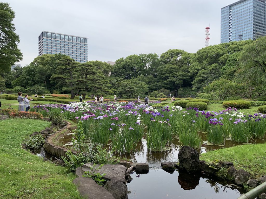
Photo by Michelle Chin.
Around the city, plants intentionally cover the outsides of some buildings. Even the DMM.com office that hosted Design Matters Tokyo was full of lush, green living walls on the interior. As I looked past the plant walls and outside the window, I would see the urban metropolis of Tokyo with gray buildings and glass windows. Typically, I wouldn’t see the two co-existing in the U.S.
Traditional and futuristic
Older, large cities often preserve historic buildings or have historical areas (e.g., Philadelphia’s Historic District), but it’s slightly different in Japan. In Tokyo, historic shrines and temples are still actively used today. Amongst these century-old buildings are futuristic skyscrapers and landmarks like the Mode Gakuen Cocoon Tower or Tokyo Skytree.
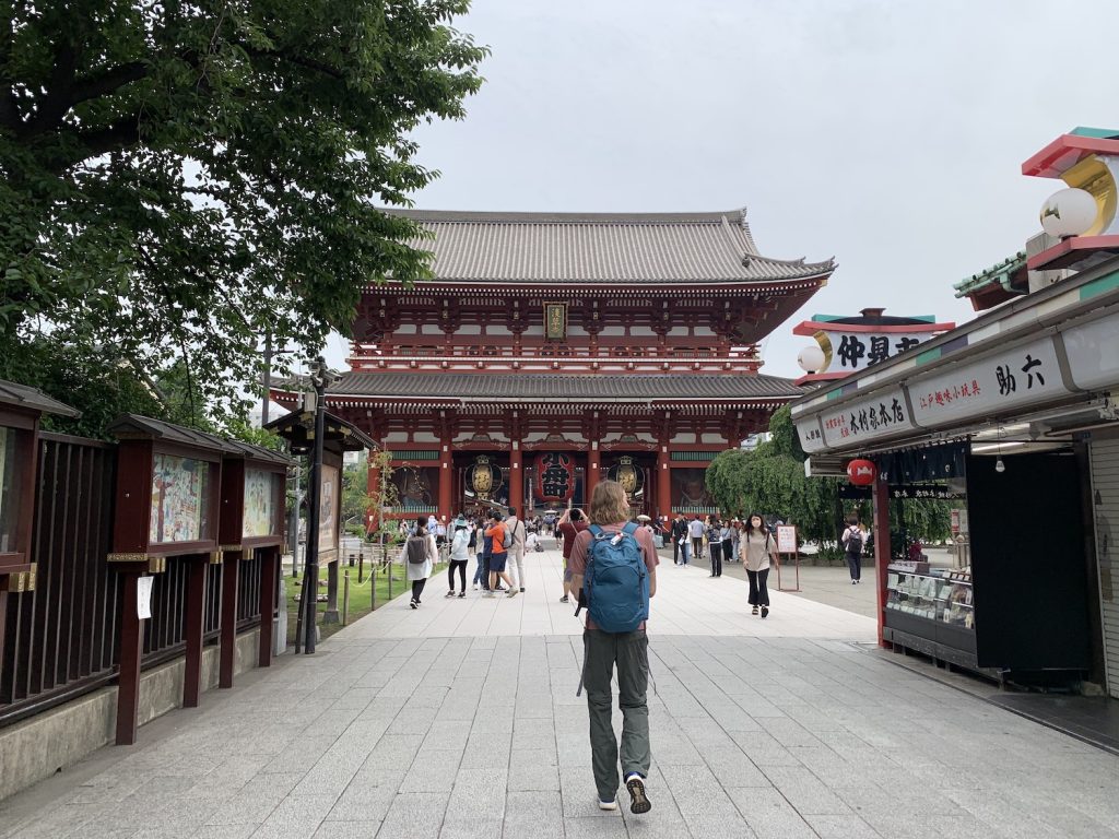
Photo by Michelle Chin.
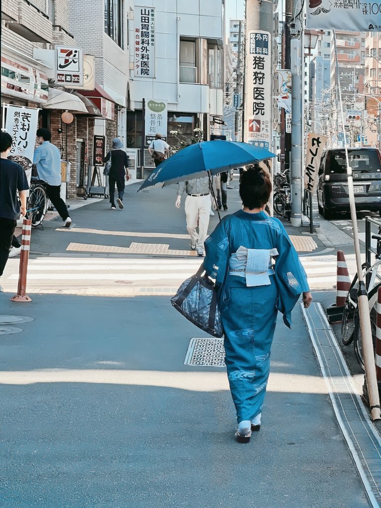
But the co-existence of traditional and modern goes beyond buildings. In the sea of daily commuters at train stations, I spotted some people wearing traditional kimonos going about their day. Kimonos have existed for hundreds of years, and it was cool to see how people still wear them today. When I think of the U.S. wearing era-specific clothing, it’s usually people involved in colonial or Civil War reenactments.
Bustling atmosphere and quietness
Almost 14 million people live in Tokyo, nearly twice New York City’s population! Yet, Tokyo is a much quieter place. Even with so many busy commuters, there’s an air of quietness. It’s not entirely silent, but I didn’t hear the typical significant city noises of loud talking, music, yelling, or car horns blaring. When I walked around, I could be amongst the big-city skyscrapers, but I could make a few turns down some small streets and enter a different world of quiet neighborhoods with small homes.
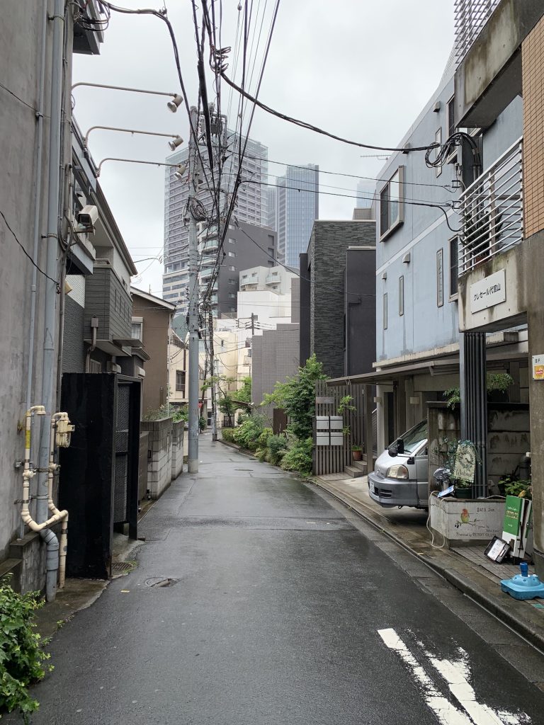
Photo by Michelle Chin.
Simple and complex
From a UX perspective, the co-existence of simple goals and what seemed like complex processes sparked the most curiosity in me. Hospitality is a huge part of Japanese culture. “Omotenashi” is the concept of looking after your guests by providing them with the best service. It sounds like next-level user experience design.
When it came to simple goals of ordering food, taking the train, or buying a drink from a vending machine, I experienced what felt like complex processes. But the steps made sense and didn’t feel like a bad user experience. Instead, it allowed me to get exactly what I wanted without too much trouble.
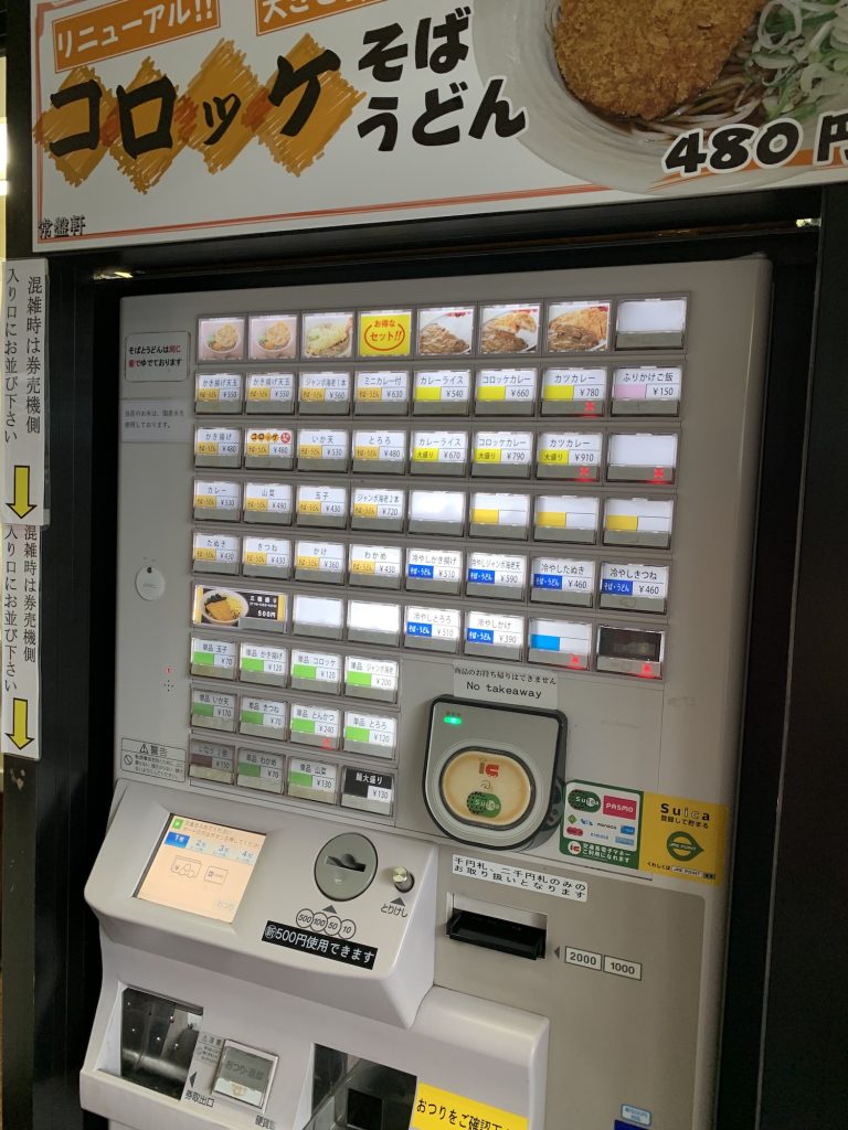
Photo by Michelle Chin.
Ramen shops typically have a ticket machine, where you order food by pushing several buttons. There are a set of buttons for you to choose your base ramen, then a bunch of buttons to add any toppings, sides, or drinks. After paying, the machine issues a ticket, which you bring to your seat, and the restaurant fulfills your order. The machine looks intimidating initially, but it’s easy to use. When ordering this way, the customer gets precisely what they want without a lengthy conversation between them and the wait staff. (To be honest, I find ordering breakfast at American restaurants very exhausting because they have to ask how you want your eggs, what kind of bread you want, etc.)
If the simple goal is “give the customer ramen,” then a simple process could be to offer only five options for ramen. Many ramen shops in the U.S. do this, but you’re kind of stuck with whatever toppings the meal comes with. You could ask to omit items and add in others, but sometimes a customer can feel like they’re going out of their way. Or it feels like you’re being bothersome. It can also make the order complex, which leaves room for error.
So this co-existence of simple goals and complex processes feels like it creates a better experience. Everything from ramen shops to vending machines to toilets provides people with a myriad of options so they can get exactly what they want. It’s different from typical Western-based UX design, where we give people what the majority wants.
How can we apply the concept of co-existing opposites in our design work?
I’m still trying to figure this out, but I keep coming back to examples related to data-rich applications. When I worked on a design system team, we had a minimal aesthetic and used white space to provide simplicity. However, some of our products included data visualizations, analytics dashboards, and managing complicated systems. When designers applied our brand and design aesthetic to those products, product managers, and users weren’t happy with them. Users wanted to remove the whitespace to leverage as much screen real estate as possible. They wanted as much data to surface to make decisions and view information comprehensively. It made sense, and we created a more compact set of UI components in our design system to meet this need. Thinking of a “co-existing opposites” approach, I would love to go back and see if there’s a way to provide the data density needed and balance the UI with more breathable space and minimal elements.
When it comes to simple goals and complex processes, this is a challenge many of us frequently face. We often settle on designing things for the majority to provide a good user experience. But can we surface all the options without overwhelming the users so all the users can get precisely what they desire? I’d love to hear if you try this or have existing examples.
Thinking more broadly, I’m sure there are other possible applications of the “opposites co-existing” idea that I haven’t considered. Please share your thoughts with the readers and me if you think of any.
What else does this tell us?
My visit to Tokyo was just one example of exploring one culture through a user-centered lens. But there are so many other cultures out there that can inspire us to design better experiences for everyone. I encourage you to explore different cultures by thinking about a place visiting a place you wouldn’t typically consider visiting. Leave your biases behind and open your senses to learning and observing what life is like there. There might be similarities and differences that can help build empathy and influence how you design.
While we don’t always have the means to travel, everyone can still learn a lot about other cultures by doing a little research online. For example, you can pretend you’re visiting a place and search for YouTube videos on what it’s like to take local transportation, what foods people typically eat, and so on. You can search for design agencies or meetups to get a sense of the design culture, too. It might not be an equivalent experience to visiting in real life, but it can provide more context and empathy. And if you have questions, you might be able to find someone in your professional network to speak with and learn more.
Cultural Personas
To be truly inclusive requires hiring a well-rounded, multi-perspective team. I cover that in a previous presentation at the Design Matters DEI & Design Masterclass. But we don’t all have the means to reach that goal immediately. Instead, as a design advocate and a DesignOps nerd, I’m always thinking of an interim solution and what that might look like as a shared resource. I wonder if creating a set of cultural personas would be worth making. They would consider specific cultural practices and summarize how they can affect and influence design. It wouldn’t be like experiencing the real thing, but it could help us get a broader sense of how the world lives, so we can ensure we’re trying our best to design truly inclusive experiences. If you’re interested in working on this project with me, please feel free to reach out.
* * *
Michelle will give a talk at the digital design conference Design Matters 23, which will take place in Copenhagen & Online, on Sep 27-28, 2023. Get your ticket here! And if you want to connect with her, go to LinkedIn, Instagram, or Twitter.
Cover photo: Michelle Chin.