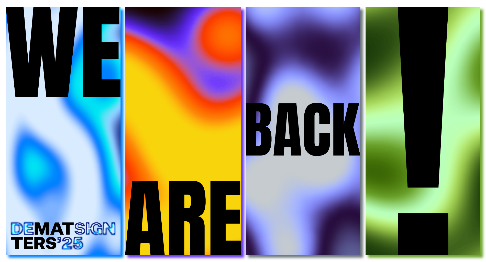
Fluid like water, unwavering like earth, free-flowing like air, and fierce like fire. Design Matters is stepping into a new decade.
The festivities are over. Design Matters’ 10th anniversary was a blast, but now it’s time to burst the balloons and sweep up the confetti. 2025 marks the beginning of a new era, with a fresh set of adventures glistening on the horizon. And what better way to brace yourself for such a journey than with a new identity that unites the four classical elements of matter?
If Serenity, Passion, Lightness and Growth Were Colors
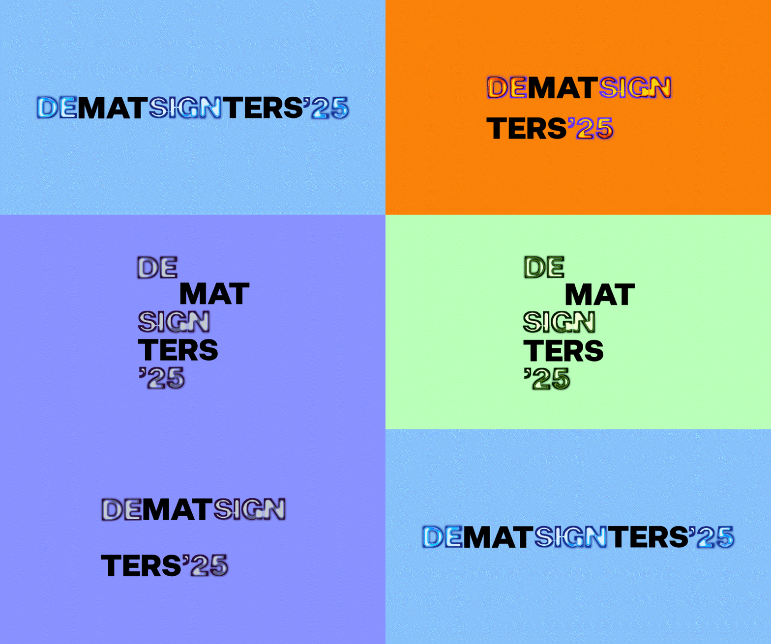
In our new brand identity, colors play a pivotal role in bringing the essence of the four elements—Water, Fire, Air, and Earth—to life. We’ve crafted a unique color palette for each element, allowing their distinct qualities to shine through.
The Palette That Makes a Splash
Water embodies adaptability, calm, and serenity. Its palette features soothing hues such as soft sky blue and serene azure, accented by vibrant turquoise and rich navy to add ocean-like depth and harmony.
The Palette That Makes the Sparks Fly
Fire symbolizes passion and energy. To evoke its fiery spirit, the palette includes rich red, vibrant orange, and intense yellow, creating a sense of warmth and vitality. These are paired with bold accents of han purple and smoky black, which add contrast and depth, embodying the smoldering and transformative aspects of fire.
The Palette That Feels Easy-Breezy
Air represents freedom, movement, and lightness. Its palette features a soft gray and a serene lavender hues that add a refreshing touch. They are accented by a muted slate green, a dusky purple-blue and a deep plum that adds sophistication.
The Palette That Grounds You
Earth conveys stability, growth, and nourishment, and the color palette inspired by this element reflects these foundational qualities. Drawing from the rich, grounding tones of nature, it features vibrant, fresh greens that symbolize renewal, complemented by deep, earthy greens. Soft, neutral linen tone provides balance, offering a calming contrast that ties the palette together, creating a harmonious and rooted aesthetic.

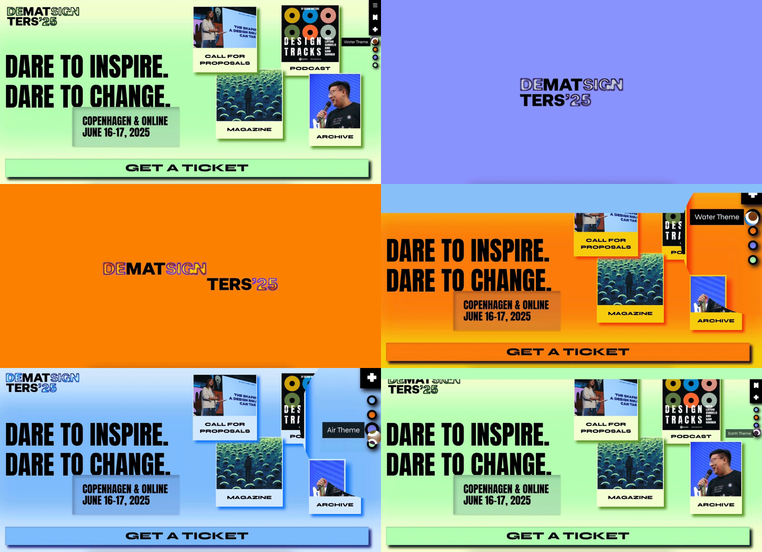
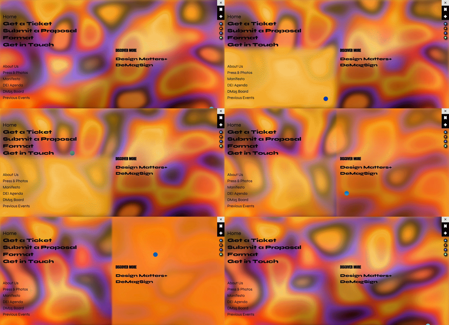
Such a large number of colours appearing at the website at once could potentially overwhelm users, so we’ve given them the option to customize the experience. Whether you’re feeling fiery like flames or calm like sea foam, you can select the element that you relate to the most. Once chosen, the website will refresh with a new color palette, tailored to reflect your mood and connection to the element.
No More Solids, A.K.A. Colors in a Blender
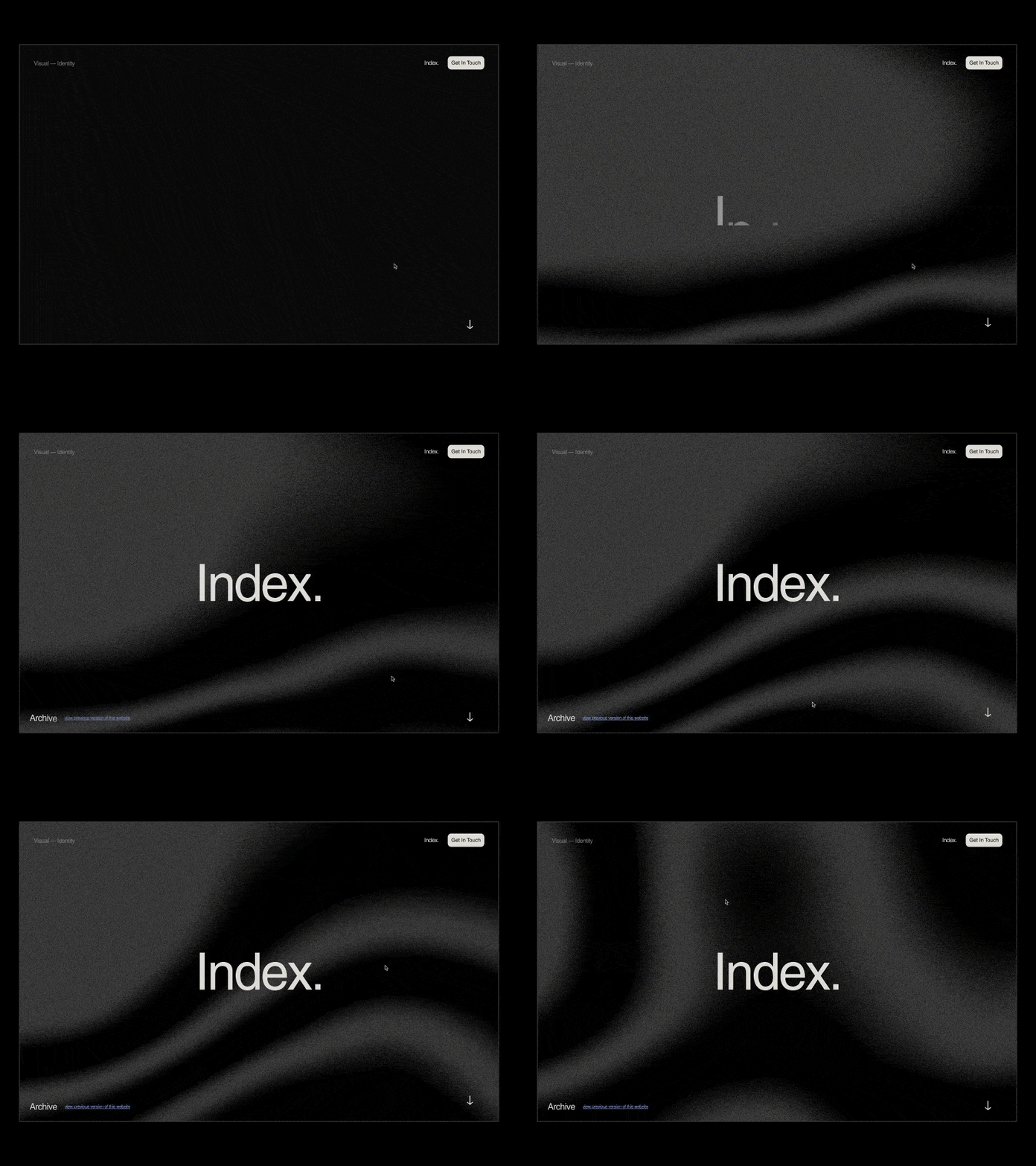
To carry on in the spirit of the four elements of matter and to capture their dynamic energy, we opted for gradients as a key visual component. Gradients allow for seamless transitions between hues, mirroring the natural flow and interplay of these elements in the world around us. On the website, these gradients move slowly in the background (it’s like watching ingredients slowly mix together in a blender), however users can interact with them—by simply moving the cursor, they influence the direction and flow of the gradients. This creates an engaging experience, allowing users to feel connected to the elemental theme and adding an extra layer of interactivity to the design.
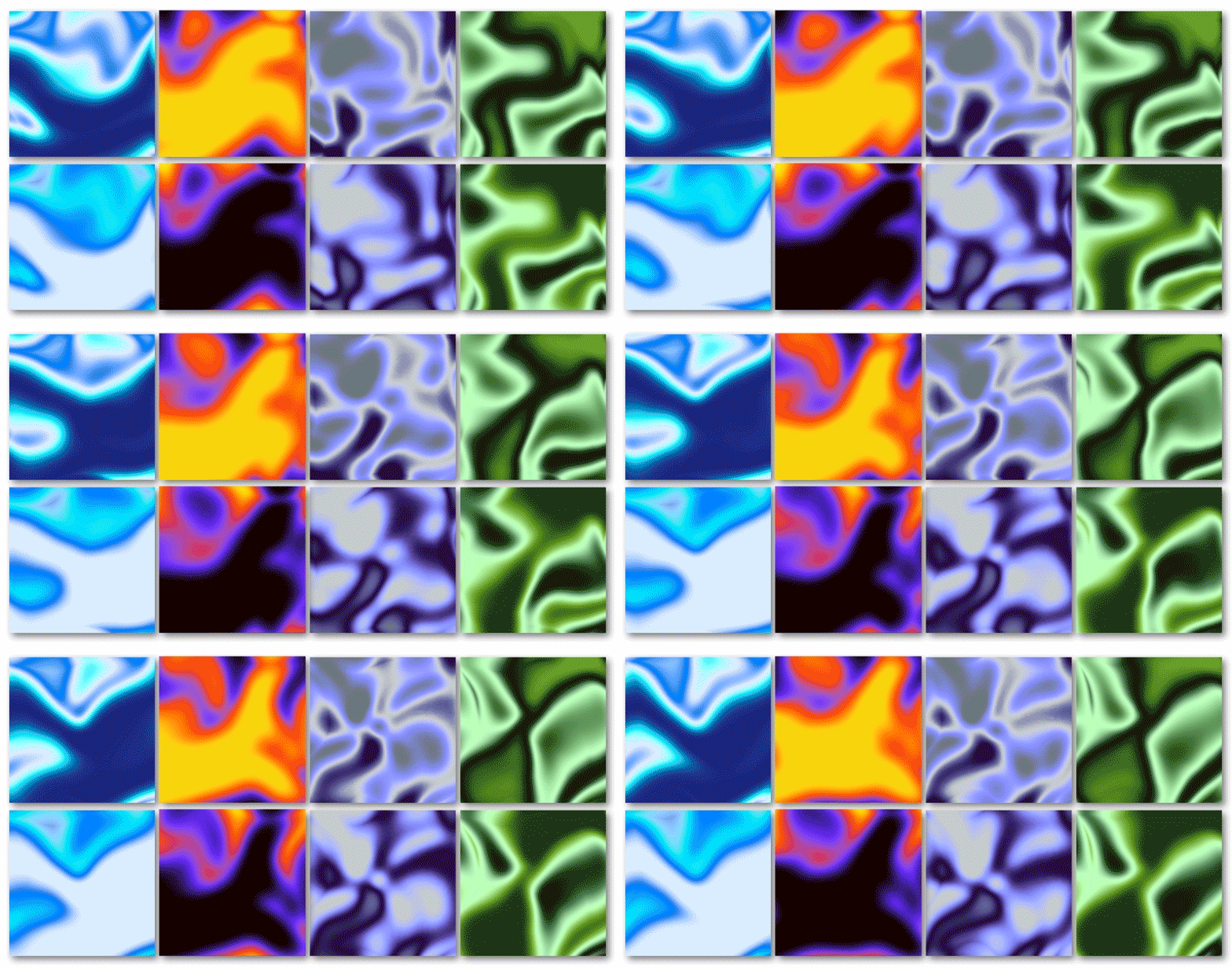
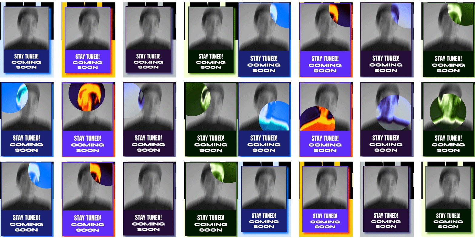
Moreover, we applied gradients to the pictures on the website. For instance, the elemental nature of the line-up images is revealed when hovering the cursor over them, while the full-width images metamorphose upon scrolling.
Through the Glassmorphic Looking Glass
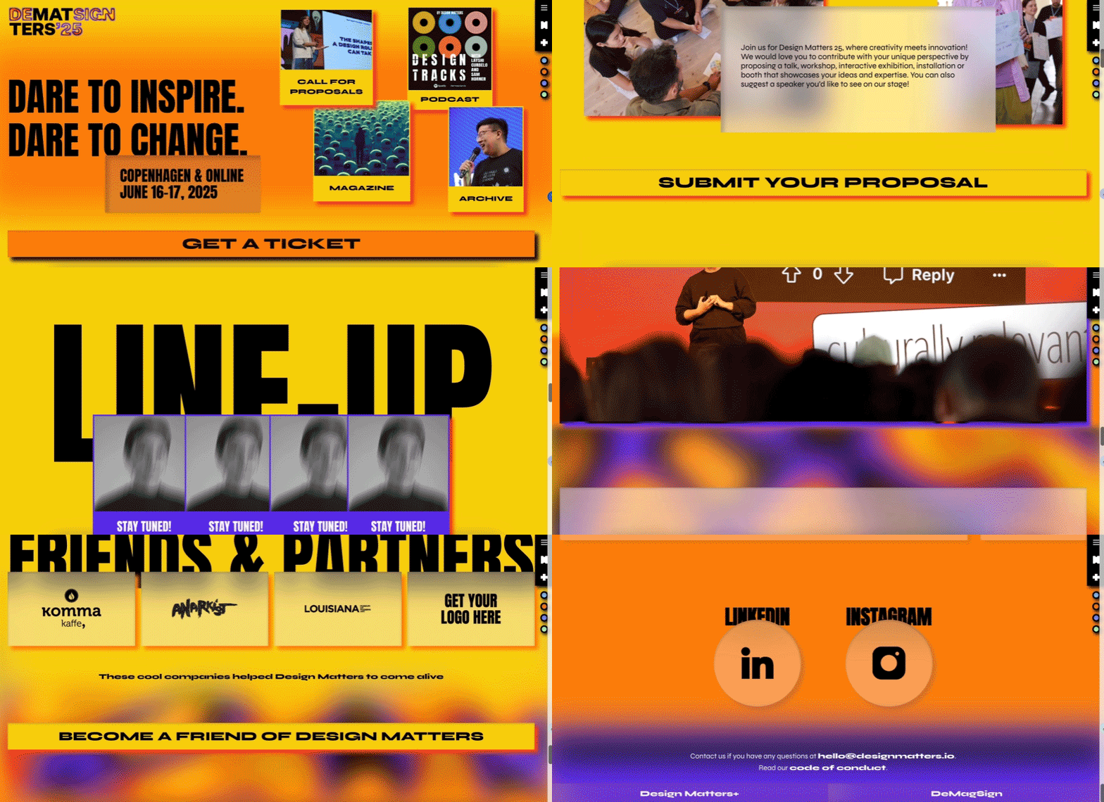
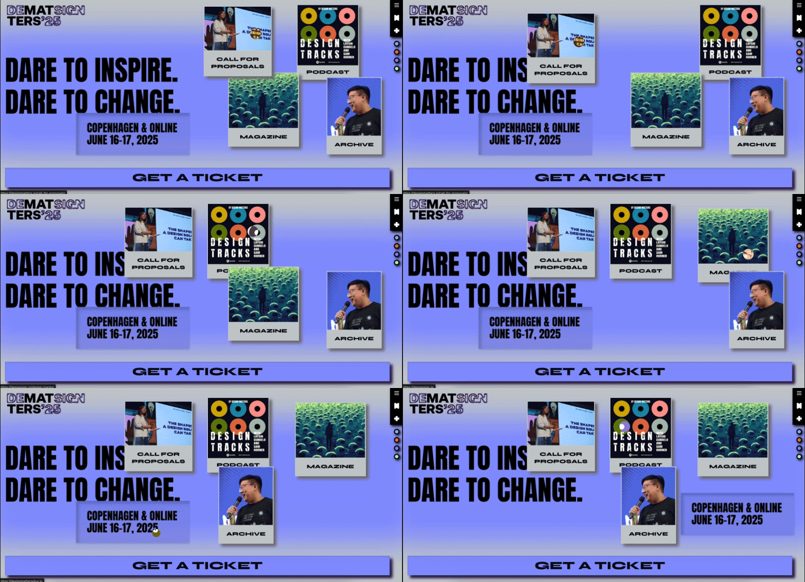
One of the trends that can be spotted on the website is glassmorphism. In our design, we incorporated glass textures to create a modern, layered aesthetic bringing depth and sophistication to the user interface. A handful of design elements, such as icons, input fields or content cards, feature frosted glass effect with soft blur and semi-transparency, which allow the background textures and images to subtly show through. This approach provides a polished and immersive experience, giving users the impression of looking through translucent surfaces that shift and adapt as they interact with the website.
Scrolling in Style
Inspired by the gentle flow of water and breeze of air, we used the parallax effect to evoke a sense of effortless movement. Smooth parallax scrolling where elements subtly shift as the user scrolls enhances the feeling of floating or gliding. This dynamic interaction consisting of the background and foreground elements moving at different speeds, adds dimension and visual intrigue while making the interface feel more organic and fluid.
…and More
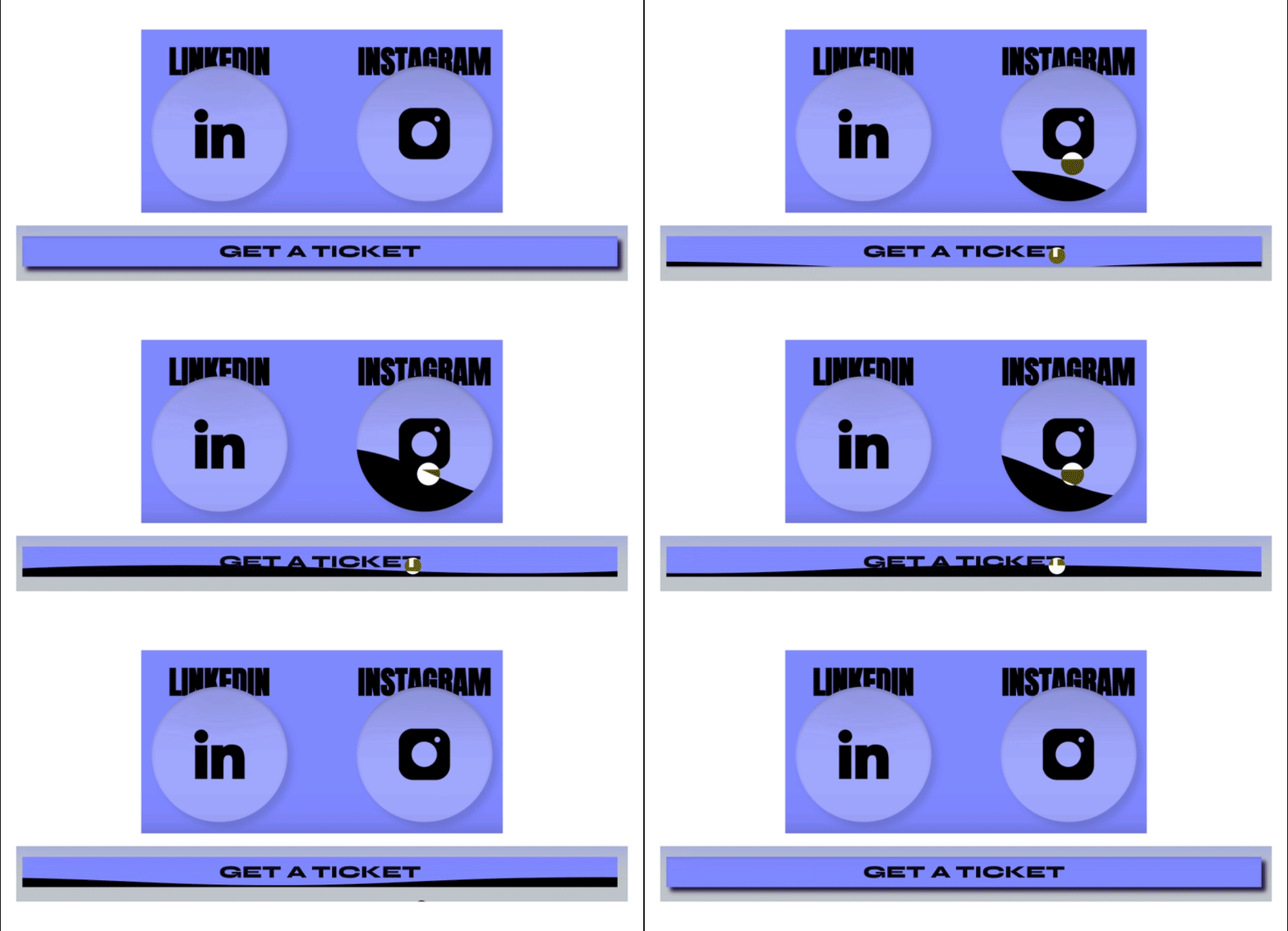
Another ‘detail’ added strategically to create depth and enhance visual hierarchy on the website is drop shadow. It is particularly applied to the buttons and images, allowing them to pop off the page and draw attention. These shadows also help to balance the layout, adding contrast and ensuring that key elements, like calls to action, remain visually prominent. Additionally, we implemented a drag-and-drop feature on the website to offer a more interactive user experience, allowing visitors to easily move elements around. To further enhance this fluidity, icons and buttons gently “wave” on hover, mimicking the natural movement of water. This subtle animation adds an organic touch that aligns with the website’s theme of dynamic and calming motion.
The Tale of Tall, Wide and Variable
After evaluating our key graphics and effects, it was clear what requirements our typography needs to fulfil. It should be simple enough to complement the complexity of the other website ingredients but still prominent enough to make a statement.
Anton-ishingly Impactful
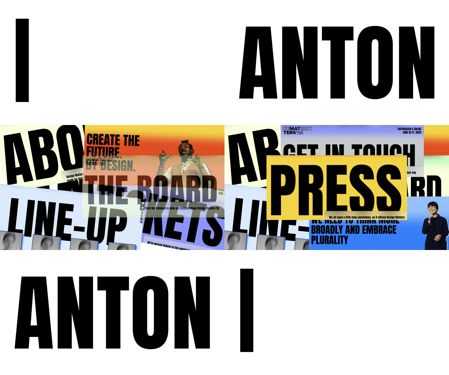
The first font we’ve chosen is a bold, narrow sans-serif typeface that commands attention – Anton. Used primarily for oversized titles, Anton’s condensed structure allows for impactful statements without taking up too much horizontal space. Its thick strokes and tight letter spacing give it a strong presence, making it ideal for headlines that need to capture attention immediately.
Getting (B)older, Getting Wis(d)er!
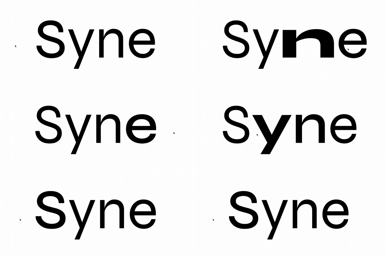
Complementing Anton is Syne, a geometrical variable font that offers versatility in both form and expression. What sets Syne apart is its ability to shift in both weight and width, growing not only bolder but also wider as it thickens. This unique characteristic makes Syne suitable for everything from body text to subheadings. Its geometric structure adds a clean, modern look to the design, while its variable properties provide a playful, responsive quality.
Together, Anton and Syne offer a powerful typographic synergy creating a balance between bold impact and flexible sophistication.
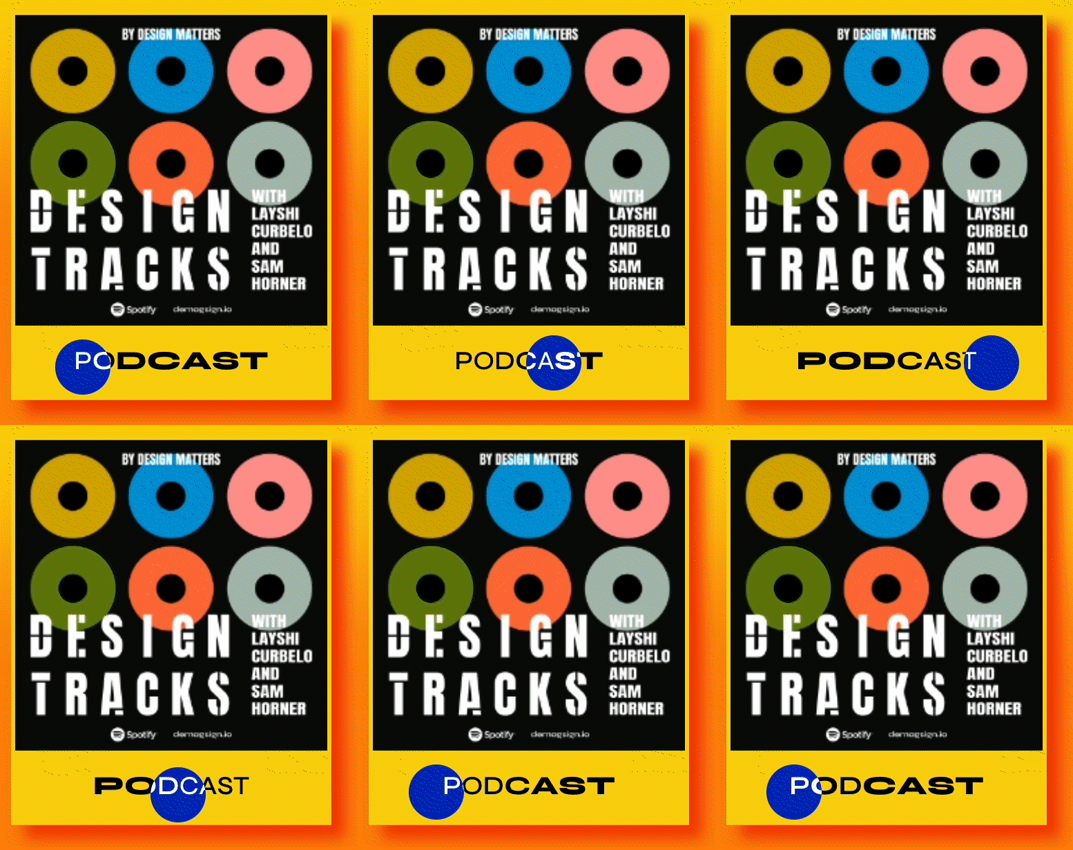
Once Upon a Time, There Were Water, Fire, Air and Earth
…And each of these elements embodied unique qualities that inspired colour palettes, gradients, and interactive elements in our 2025 identity. Integrating modern design trends like glassmorphism, drop shadows, and playful interactions brought this elemental concept to life in a way that’s both engaging and contemporary.
Now, there’s only one thing left to do: discover the answer to a long-standing question: What are the elements that matter in the world of digital design? Let’s find out together!
Inspiration
cursor controlled gradient, color theme customization
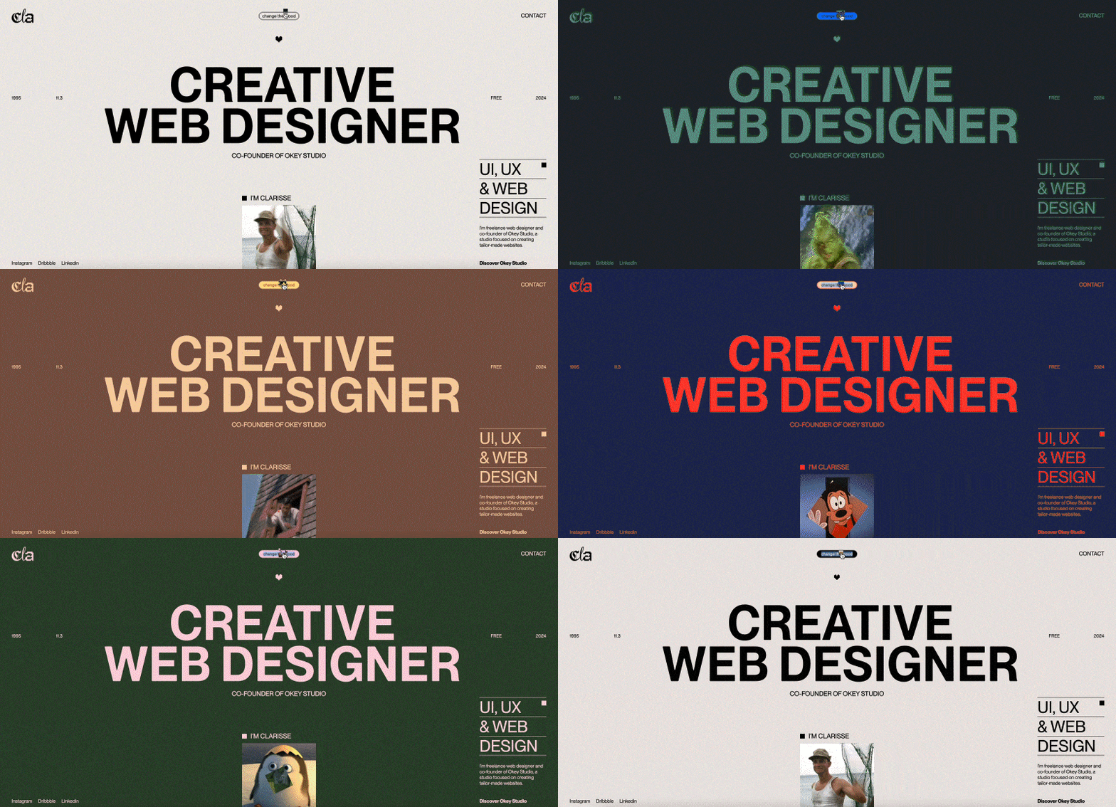
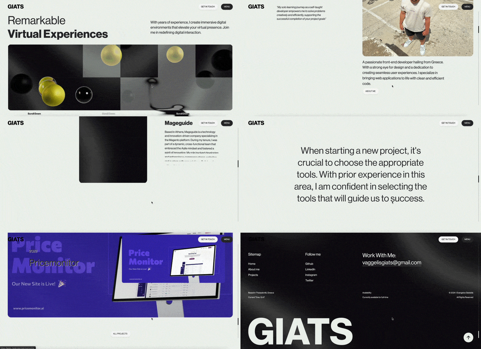
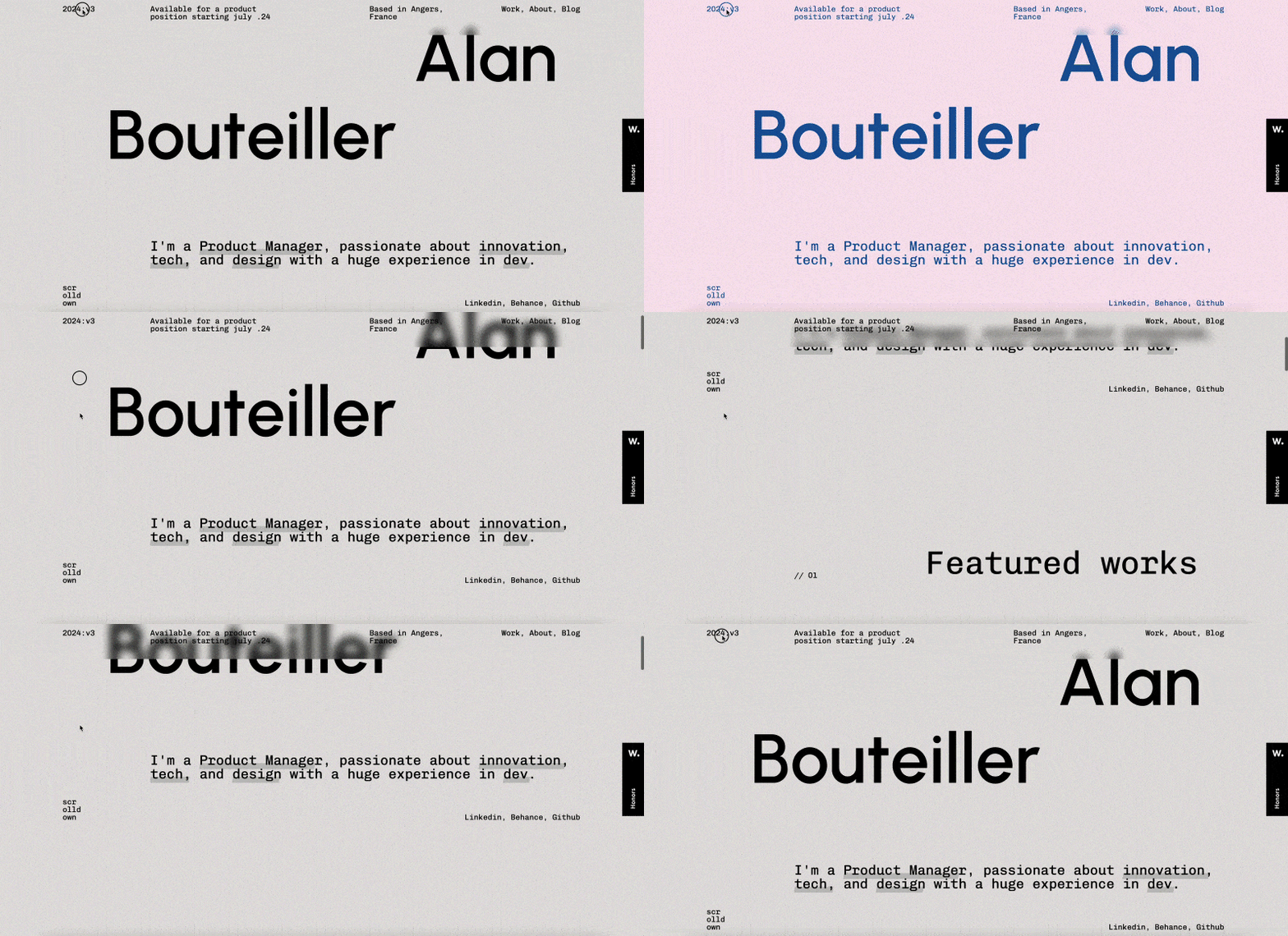
color theme customization, glassmorphism
